The way you communicate your research findings often defines the whole future trajectory of your design process. You need to be informative, persuasive and show the true value of your study in order to actually get the suggested solution to be implemented. And for that, you need a good UX research report.
Let’s take a look at what a UX research report should contain, how to structure it effectively, what best practices to follow, and explore some great examples of user research reports from other companies.
Key Takeaways:
➡️ UX research reports are an ultimate way to communicate research findings to teams and stakeholders
❗ They should be clear, concise and visually appealing to engage readers.
✅ You should tailor the report to the target audience’s understanding and needs.
🧠 User feedback, visuals, and artifacts enhance the report’s credibility and impact.
💡Templates and tools can streamline the report creation process and generate professional-looking reports.
For a quick summary of the article, check out our video guide:
What is a UX research report?
A UX research report is a document that communicates the findings, insights, background and proposed solutions of your UX research study. The primary goal of creating a UX research report is to present your findings in a clear and concise way, highlight critical problems that need to be solved and share your ideas on how to solve them.
By creating a UX research report you’re ensuring that other teams and relevant stakeholders are informed about the current state of the research and the improvements that need to be done.
That’s why the quality of your report matters so much: it is often used as the main argument for convincing stakeholders to invest in UX.
UX report structure

What’s the first thing that comes to your mind when you hear the word report? A long complex, almost too-official document that is extremely boring to read? Yes, some reports really do look like that. But it’s not the case for user research reports.
You want your report to clearly present the key findings and message you want to communicate to your colleagues. That’s why the catch here is to make it as structured and straight to the point as possible.
Here are the main sections your UX research report should include:
Background
In this section you set the context for the whole report. Here you need to introduce the reader to the main problem, explain why the research was conducted and what was the initial state of the product. It’s also the section where you can describe the goals and objectives you’ve set for the study.
Your job here is to give the reader all the background information about the research situation so that they have a clear idea of what you were trying to find out, how and why.
Methodology
The next part of your UX research report is describing the research methodology that you chose for the study. Explain what research methods you used to gather information and why. Don’t forget to also briefly describe who were your study participants.
Make sure to avoid professional jargon and using complex terminology in this section. You want everyone who reads the report to understand how the study was conducted. If any research terms need additional explanation, make sure to include it as well.
Key Findings
This section should include the key takeaways of your research. What are the most important findings that you want to communicate to your team? Choose wisely and make sure to not clutter this section with unnecessary details and extra information. Make it short, sweet and straight to the point so that the readers remember it and understand the rest of your report.
To make the information in this section more valuable and easily-digestible, include user quotes from your testing, observations, or statistical data, depending on the research method. Supporting your key points with user feedback will help to grab readers attention and generate empathy.
Opportunities & Recommendations
In this section you need to translate your insights and findings into actuable next steps to present to your product and design team as well as stakeholders. Make sure they tie back to the key takeaways you’ve described earlier and provide a clear path for moving forward with these solutions.
Define clear actions that you believe the team should take. This could be specific product design changes, opportunities or even a question that you need to conduct further research on. Whatever it is, think them through and come up with optimal potential solutions that will be in line with your available resources, time and budget.
How to write a UX research report

Now that you know how the UX research report should be structured, it’s time to put your knowledge to practice and create the report. This may seem frustrating, however, trust us, by following the 6 key steps below, you’ll produce the perfect UX research report to present your findings.
Here’s how to write a UX research report in 6 steps:
1.) Define your goals
A clear objective does not only provide the roadmap for your research study in the research plan but also much-needed context for your findings. Define what you’re trying to achieve and what problem you’re aiming to solve. What information are you going to focus on in your report and what outcomes are you expecting?
By figuring out answers to all those questions you’ll be able to avoid clutter in your report and get straight to the point.
2.) Understand your audience
You need to know exactly who is going to read your report and tailor the information accordingly. A report for the development team will look different from the one created for stakeholders with zero to no understanding of UX.
By tailoring your tone of voice, wording and key information to appeal to the target audience of your report, you ensure that the message you’re trying to communicate will be successfully received and acted upon.
3.) Summarize
Go back to your research and look at the findings. You need to summarize it all in an easily-digestible format and only highlight the main information you’re trying to convey. While you may want to include every detail of your findings and research process, stop yourself, and focus on adding what’s really important and corresponds to the goals defined earlier.
Define the key insights of your findings, clearly explain the methodology and background you’ve worked with and come up with actionable recommendations and next steps you’re going to communicate.
4.) Prove your points with user feedback
Add credibility to your findings and make the report more engaging by adding feedback from real users received during the research. This may include quotes, video recordings of them facing a certain problem with your product as well as specific metrics or data from surveys.
This will help to prove your points and better explain the issues users face to those who are not familiar with the concept of UX.
5.) Put it all together
The final step is to put together everything you’ve already done and create a structured UX research report. Focus on making your report not only informative, but also visually appealing and easy to read. You can either do it yourself or use one of the UX research report templates that we’ll talk about below.
6.) Use reports from UX research tools
Alternatively, you can make use of the PDF report feature that many modern UX research tools offer.
Tools like UXtweak automatically generate customized visually appealing reports of the data obtained from the study and make it easy to share and present your findings.
Tips for creating a perfect UX research report

Here’s a summary of the main tips we recommend to follow to make your UX research report even better:
- Include illustrations and graphs
- Make it visually appealing
- Structure the information in a logical way
- Tailor the tone of voice and wording to fit the target audience of your report
- Add videos and test recordings to better illustrate issues
- Generate user empathy by demonstrating artifacts such as storyboards, personas and journey maps
- Go straight to the point and avoid information clutter
- Consider including a glossary of key terms or concepts if necessary
- Include a table of contents for easier navigation
UX research report example
A UX research report can be formatted in different ways:
- PDF file
- Slack update
- slide deck
- Notion page
Let’s take a look at 2 UX research report examples to get a better idea of how they look.
UX research report example from a UX research platform
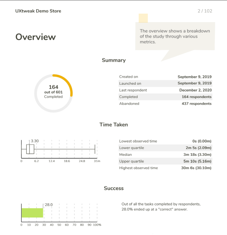
The first one will be a sample UX research report example from one of UXtweak usability testing studies. This is a perfect demonstration of a report you can generate with the help of UX research tools available online.
These reports are usually generated automatically and include all the data and analytics from your study, as well as metrics calculated by the tool. Not all platforms offer this feature, however, with UXtweak you can always count on a visually-appealing custom report of your findings.
Here are some examples of such reports from UXtweak:
Take a look at how these reports look in our demos:
The only downside of such reports is they don’t include any information about the background of your study. However, you can always just take the data you need and include it in the full UX research report of your study. This will save an enormous amount of time, compared to analyzing the data yourself.
Full UX research report example in PDF
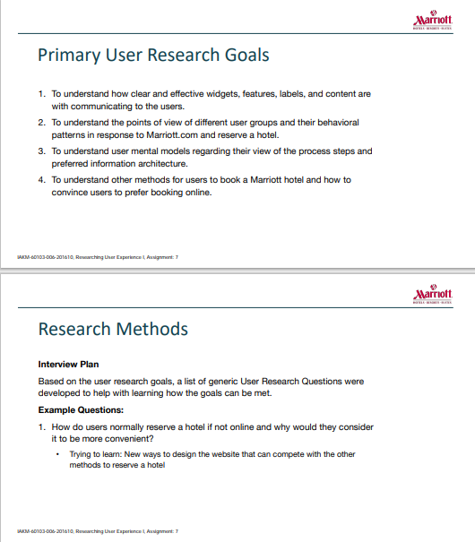
The second example is a more detailed UX research report of the study conducted for Marriott hotel chain. Although the report is detailed, it’s still very straight to the point and perfectly communicated the primary insights without overwhelming the reader with information.
The report is done in PDF, however, it’s not a hard-to read long document with tons of text, but rather a clearly structured slide deck. The report includes quotes from users to support the key points, a clear list of main findings and recommendations.
UX research report templates
To finalize and provide you with some guidance for creating your own user research report we gathered some great UX research report templates! You can download, customize them and save time on creating your own!
1. User Research Report: Summary

A visually appealing free PDF user research report template in a form of slide deck that you can use to present your findings to the team.
2. Usability Testing Report Template
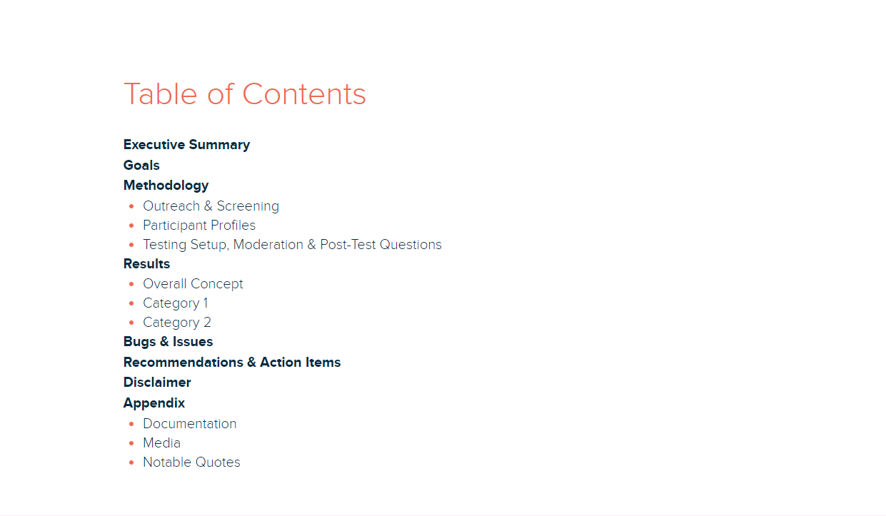
A customizable report from Xtensio to present your usability testing findings in a digestible way.
3. UX Research Report Template from Pitch
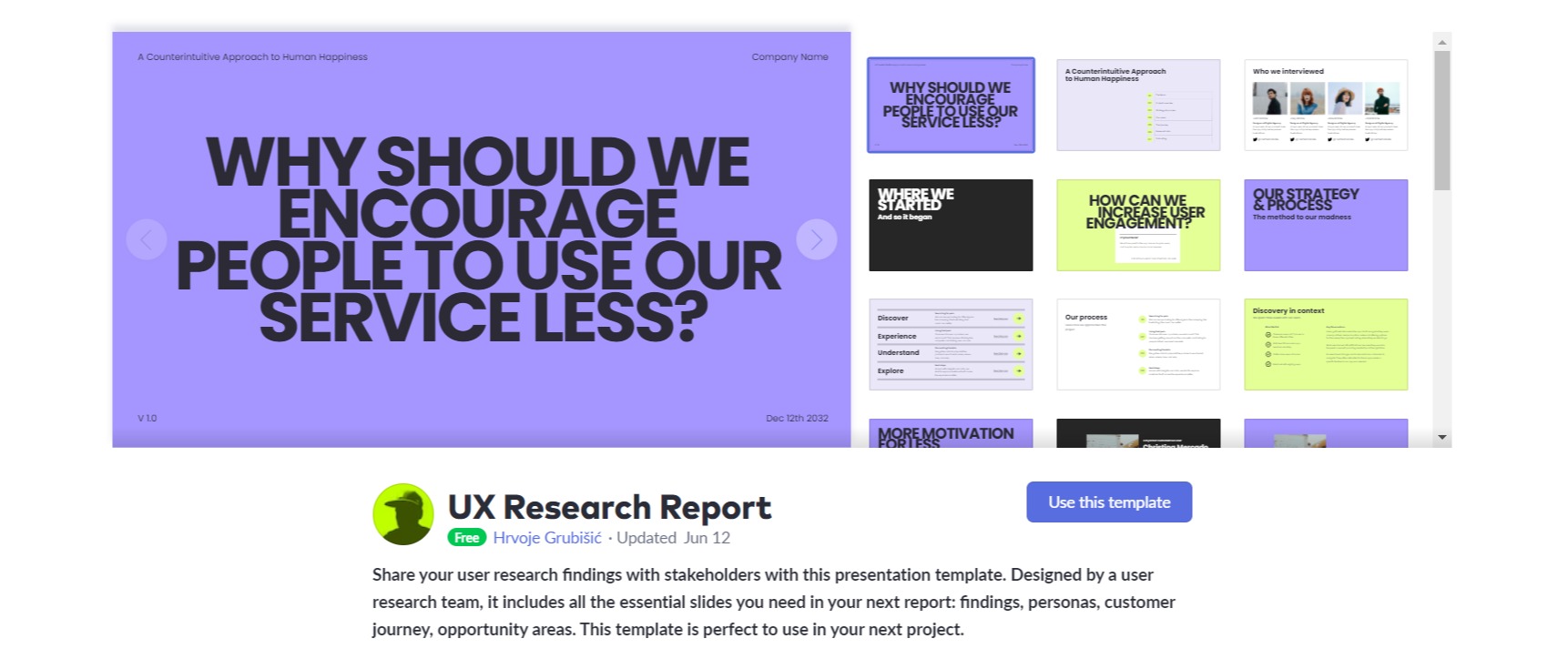
A report template with great design that you can customize in the Pitch app and use to present your findings to stakeholders.
4. Usability.gov UX Report Template
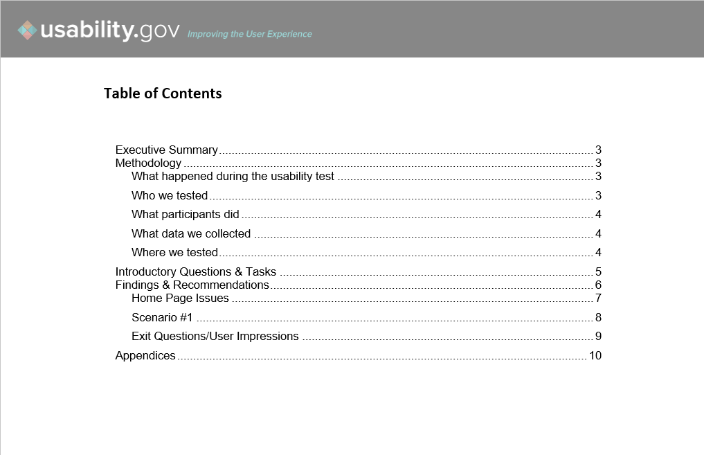
A great Word document template by industry experts – Usability.gov. You can download both short and long versions, depending on how formal you want your report to be.
5. Notion Research Report Template
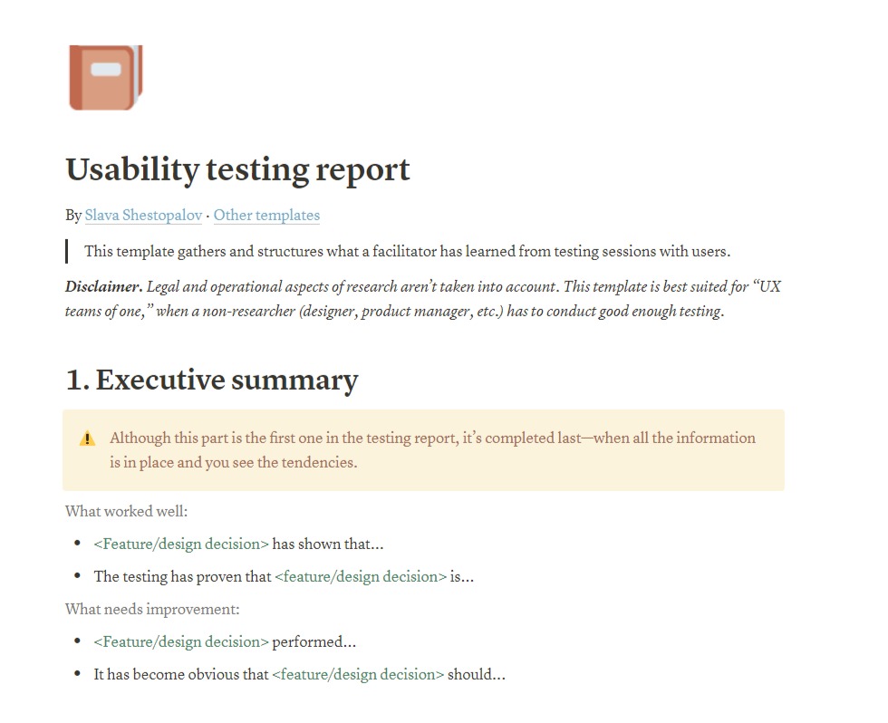
Although this is specifically a usability testing report template, that’s a great example of how you can report UX research using Notion. Download and customize the template to fit with your research methods.
6. UXBoost UX Research Template

A slide deck UX research report by UXboost with great structure and visuals that you can customize!
Wrapping up
And that’s a wrap on UX research reporting! You now have everything you need to create your own perfect report and present your findings to the team.
The next step is to register for your UXtweak account and conduct the research! Get to know your users, collect their feedback on your product and generate custom PDF reports of your findings with UXtweak!


