After you’ve created your research plan, recruited participants, conducted and analyzed the study results, it’s finally time to present your findings to colleagues, stakeholders and other people involved in the project. But how to make sure you nail the presentation, make it engaging, structured and most importantly – convincing? Read further to find our best tips for presenting the results of your UX research together with the collection of some of the best UX research presentation templates out there!
Key Takeaways:
➡️ A UX research presentation is used to showcase your research findings to colleagues and stakeholders. ❗ It helps to influence decision-making, inspire action and generate empathy towards users and their problems. ✅ A research presentation is an alternative to a UX research report. 🧠 You don’t have to create a presentation from scratch, there are many free templates available online.
What is a UX research presentation?
 A UX research presentation is the process of presenting research findings to colleagues and relevant stakeholders. The goal of conducting the UX research presentation is to communicate results of the research activities you’ve performed, share relevant insights and critical problems you’ve uncovered and propose ideas for solving them. It can also be described as an alternative to a user research report. However, while user research reports are often presented in a form of long complicated documents, UX research presentation is a faster and more convenient way to present your findings in an easy to understand and visually appealing way. If you want to learn more about UX research reports, you can check our guide or watch the video below. ⬇️ https://youtu.be/QnI4MqzIcXI
The goal of a UX presentation
The primary goal of a UX research presentation is to effectively communicate your research findings to other people involved in the project. However, apart from that, it holds several other benefits:
- Generate empathy: a good and engaging UX research presentation can help you explain user’s problems, needs and expectations to other team members and, therefore, generate empathy. This helps to humanize the user experience and shows its value even to people who may not understand it.
- Influence decision-making: by demonstrating the findings of your research, explaining their value and importance, you get an opportunity to prioritize specific design changes and convince stakeholders to invest in UX.
- Facilitate collaboration: a UX presentation explains your research activities and their results in a way that is comprehensive for everyone, even the ones not involved in the product design process. This makes collaboration between teams easier, helps to spread awareness about the products, users and necessary changes. This collaborative approach encourages discussion and helps you come up with better solutions to users’ problems.
- Inspire action: The ultimate goal of a UX presentation is to drive action and implementation of the research findings. You should not only explain the problem, but also your ideas and recommendations on how to solve them.
How to create engaging UX research presentations
 Let’s take a look at our 5 go-to tips on how to present research data in UX presentation:
1. Keep it short
Resist the urge to share every single detail of your research. Make your presentation relatively short and straight to the point. Focus on explaining the key insights and keep in mind your audience’s short attention spans. If you make the presentation too long, you risk boring them and losing their attention. Try to avoid putting any unnecessary information in your presentation and distill your research findings into clear, concise messages.
2. Show, don’t tell
The key in putting together a good UX Research presentation is making it highly visual. Empathize with your managers, stakeholders and other team members who haven’t been a part of your research process. They probably only have a vague understanding of the problem and presenting them with a few slides of plain text won’t make it much better. Your goal here is to create a clear and convincing showcase of the research process, the problem you’ve uncovered and your proposed solutions. To do that, focus on showing rather than telling. Imagine you’re talking about a specific problem users encounter, for example filling out the registration form. Instead of talking about it for 5 minutes straight, show a quick clip of a user experiencing that problem during a usability test. This will help to understand the problem better, empathize with the user and will save you time on long boring explanations.
3. Use storytelling
Use storytelling techniques to help you make the presentation more relatable, engaging and memorable. Tell real user stories, incorporate jokes to highlight the challenges users face and some of the key moments of their experiences. This will help other team members to easily put themselves into users’ shoes and connect on a deeper level.
4. Make it actionable
The main goal of your presentation is to highlight critical problems users face and present potential solutions. Therefore, after your presentation your audience should have a clear idea what needs to be done, how it will help and who is going to work on making the changes. Avoid being vague and unclear in your recommendation statements and focus on explaining and supporting your solutions with relevant data.
5. Encourage discussion
Encourage discussion among your audience as well as vocalizing any other questions, comments or concerns that arise. This will help to engage them even more and promote a better understanding of your research findings. And not only that! The biggest benefit of encouraging communication during your presentation is that by listening to their opinions and concerns you’re able to fine-tune your solutions to the problems, come up with better ones and overall just generate more effective ideas for improvement.
Things to avoid in a user research presentation
 When preparing a user research presentation it’s important to keep in mind potential pitfalls that can influence its effectiveness. Here’s a list of mistakes to avoid when presenting the results of your research:
- Using too much jargon and technical language: remember, that not everyone in your audience is familiar with complex UX terms and internal jargon. Use a simple language, maybe even a conversational tone to make sure everyone understands what you’re talking about.
- Lack of structure: going back to the topic of storytelling, try to organize the information you’re going to present in a structured manner and give it a logical flow.
- Cluttered slides: don’t overload your slides with information. Use concise bullet points, key phrases, and compelling visuals to convey information effectively. Make sure your presentation’s design is not too flashy, so that it doesn’t distract the audience.
- Getting lost in details: avoid focusing on little details that don’t matter and instead try to explain how your research findings and their implications can benefit the bigger picture and the product overall.
- Lack of preparation: your presentation should be easy to listen to. Practice before you present and make sure that you don’t run through the slides, stutter or forget anything. A confident delivery will assure that the audience hears and understands you, instead of getting distracted by your poor presentation skills.
banner
UX research presentation example
Now that you know the keys to effective research findings presentation, let’s take a look at an actual UX research presentation example. The UX research presentation example you see below is created by Visme and can be also used as a template, which we’ll also leave a link to. This presentation is a great example of how you can provide an informative delivery of key insights and actionable recommendations. The structure of your UX research presentation can vary based on the objectives and the main information you want to convey, however, most of the times all presentations will follow a similar structure, same to the one in this UX research presentation example:
- Intro
- Background
- Objectives
- KPIs
- Research Methodology
- Participant Profiles
- Key Findings
- Recommendations
See full UX research presentation example. 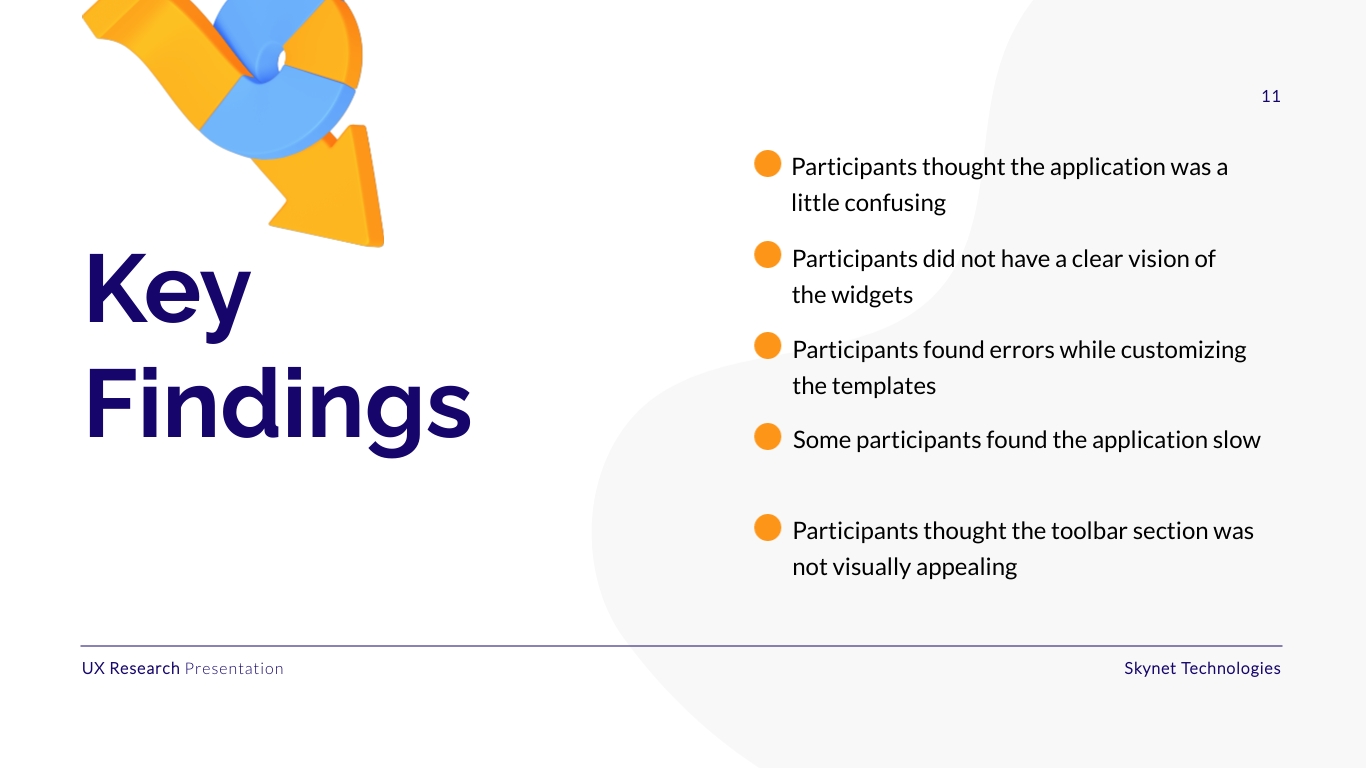
UX Research Presentation Example. Source.
This example is great because it presents information in a quick and easy to understand manner, together with the clean minimalistic design. Therefore, the audience is able to gauge all the necessary details about the research in just a couple of slides. The only thing that it is lacking is more application of the “show, don’t tell” principle. Depending on the research method, we’d recommend adding some powerful quotes from the user tests, as well as video recordings of participants facing their primary problems with the product. This would help to generate empathy and help the audience understand users better.
UX research presentation templates
1. UX Research Presentation Template by Visme
 A customizable colorful template that will help you condense the findings of your UX research into small bits and present them in a digestible way. 📥Get the template
2. UX Presentation Template by Miro
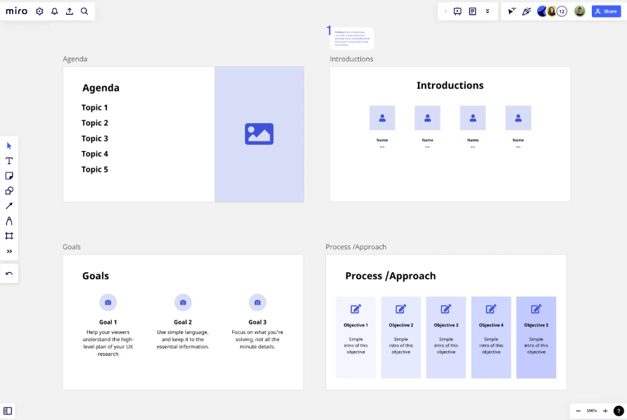 A template by one of the most popular whiteboarding platforms that is available on their free plan and is perfect for presenting your user research findings to the team. 📥Get the template
3. User Research Presentation Template by Furquan Ahmad
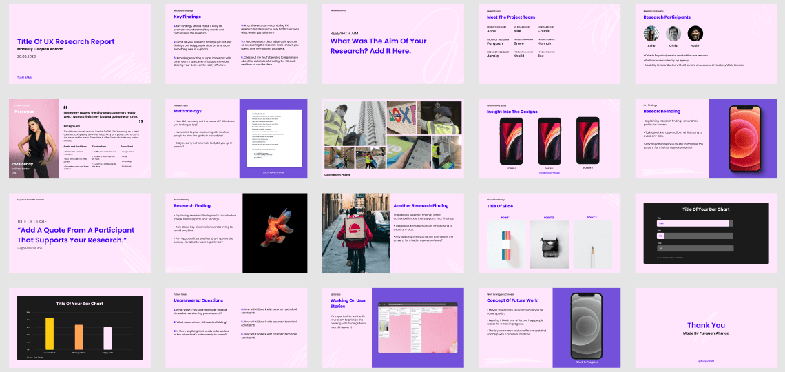 A beautifully designed report template available to anyone in the Figma community. The author of the template even provides a video explaining the step-by-step process of creating a good UX research report. 📥Get the template
4. UX Research Presentation Template by Decoding Research
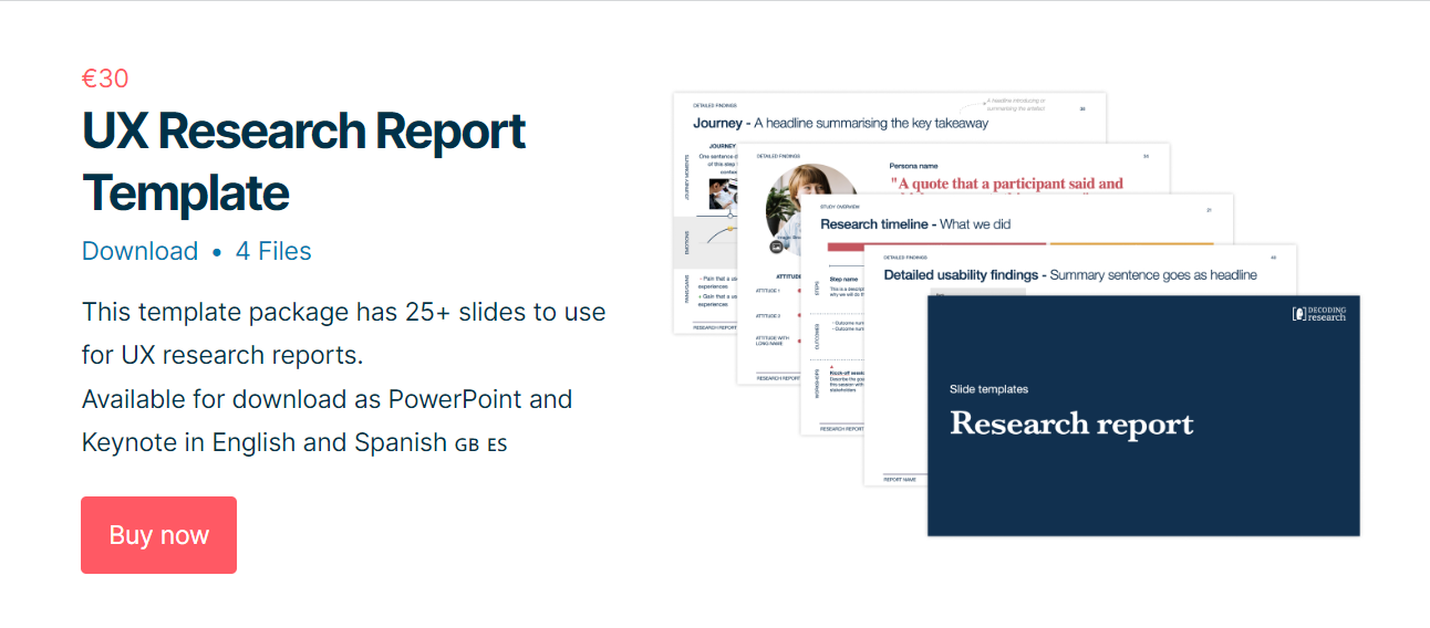 This is a paid template with 25+ slides to help you present your research findings. The template is available for download as PowerPoint and Keynote in English and Spanish. 📥Get the template
5. Research Findings Presentation Template by Salman Farsi
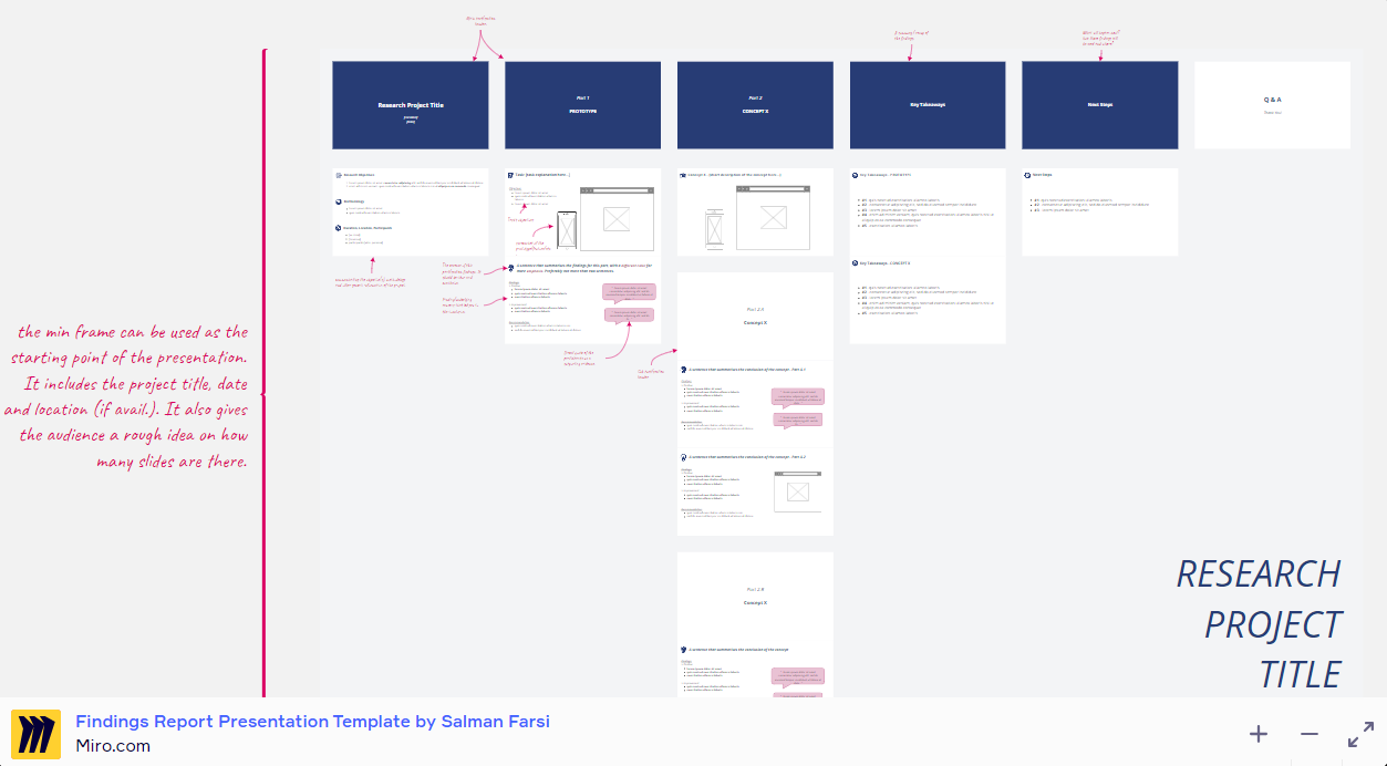 A template created in Miro by an experienced Product Designer to speed up the report/finding presentation process and focus more on the content. 📥Get the template
6. Usability Testing Results Presentation
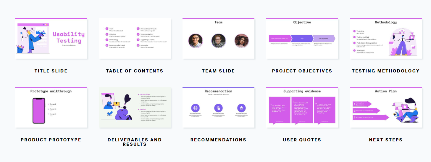 A customizable template specifically to help you present your usability testing findings in a clear and visually appealing way. 📥Get the template
Wrapping up
Now that you know how to put together a UX research findings presentation, it’s time to take action! Conduct your study, empathize with users and do your best to solve their problems with your product. And for the research part of it, UXtweak is always here and ready to help. Leverage our numerous UX tools, analyze data and generate custom PDF reports for your research presentations! Create a free account and start today!


