We all know that UX design is a broad discipline and there is no go-to solution that works for all projects. However, there are still some common principles that UX designers follow and work by. Those are focused on remaining consistent and user-centered throughout the UX design process.
What are UX design principles?
UX design principles are fundamentals that every UX designer needs to know and follow throughout the design process. They help to always design with the user in mind and solve problems effectively.
Main principles of UX design
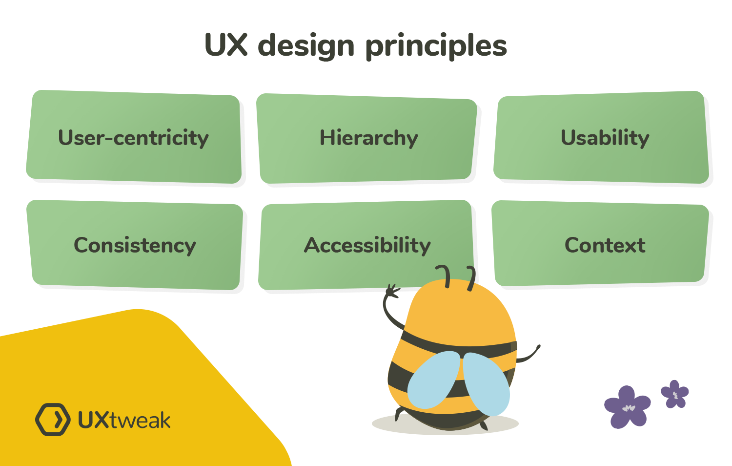
There are 6 main UX design principles and we’ll discuss them further in this guide:
- User-centricity
- Hierarchy
- Usability
- Consistency
- Accessibility
- Context
User-centricity
The first and the most fundamental principle of UX design is user-centricity. In other words, putting your user, their pain points, wants and needs in the center of your UX design process. The main way of doing so among UX designers is through continuous user research and usability testing.
The main mistake one can make when designing a new product is making it according to their own assumptions, without taking the user into account. This can lead to creating a product that doesn’t actually solve the user’s problem. Noone wants to waste their time and money on creating something useless, right?
Making user-centricity one of the core principles of your design process will help to create products that users love, want and need.
Hierarchy
Visual hierarchy is another fundamental part of UX design. It helps to draw users attention to the most important elements on the website and optimizes navigation. Hierarchy in design is mostly emphasized with the use of color, size, contrast and other elements.
The most simple example of hierarchy is the heading and the paragraph text that we so often see as a part of website content. The heading is usually bigger and bolder than the main text of the paragraph which signifies that it should be read first and conveys important information.
The use of hierarchy helps designers draw attention to the most important content on the page and helps to optimize the user flow, guiding users towards their goals.
Usability
Usability describes how easy it is for a user to interact with the product. The goal of any UX design process is to create a product with great usability, because without it, good UX is unachievable. Usability measured with the help of usability testing throughout the whole design process, during the prototyping stage, before and after the launch.
Good usability assures that users are able to easily perform specific tasks with your product. Usability testing is an ultimate way to spot and eliminate roadblocks, confusions and significant UX issues. It can be performed online with the help of specialized usability testing tools. Nowadays, you can test not only websites, but also prototypes, applications and even your competitor’s websites.
Consistency
Consistency is an important element both in UI and UX design. In the UI design process it’s all about visual consistency. As a designer, you need to make sure that your branding is consistent across all the different pages and products. Using the same fonts, colors, layouts and brand elements is essential for a clear brand image. Consistency in terms of branding is achieved by creating and following design systems.
When it comes to UX design consistency is important in a sense of functionality. Your users have different mental models and are used to specific layouts and the way things work. They have certain expectations of your website’s layout, navigation positioning and look as well as some other common functionalities. In some cases you might want to reinvent the wheel with some creative design element, but it may not be intuitive for the user. Always keep in mind that your end-users spend most of their time on other websites.
It’s crucial to know when you can add some creativity and when it’s better to stick with common familiar patterns. UX research and usability testing will help you decide.
Accessibility
Making your product accessible means designing it to be usable for as many people as possible. This includes people with disabilities, visual, auditory, cognitive and other impairments.
Accessibility can be achieved by implementing color contrast, adding alt text to images, using headings correctly and giving descriptive labels to your links. Check out this guide to website accessibility for more info.
Context
Personalization and adapting to specific contexts in which users interact with your product is key to providing exceptional user experience. Conducting user research can help you find out when and where users might need your product, as well as how they are going to be using it.
This includes all the specific circumstances that may influence or interfere with the interaction. This can be the size of the device, background noize etc. All this information can help to adapt your design to those specifics and, therefore, provide better UX.
There are multiple ways you can gain more context in UX design and one of them is creating a user journey map. Learn how to make one in our User Journey Map Guide.
UX design best practices
Now that we covered all the basic principles of UX design, let’s take a look at some tips you need to keep in mind as a designer.
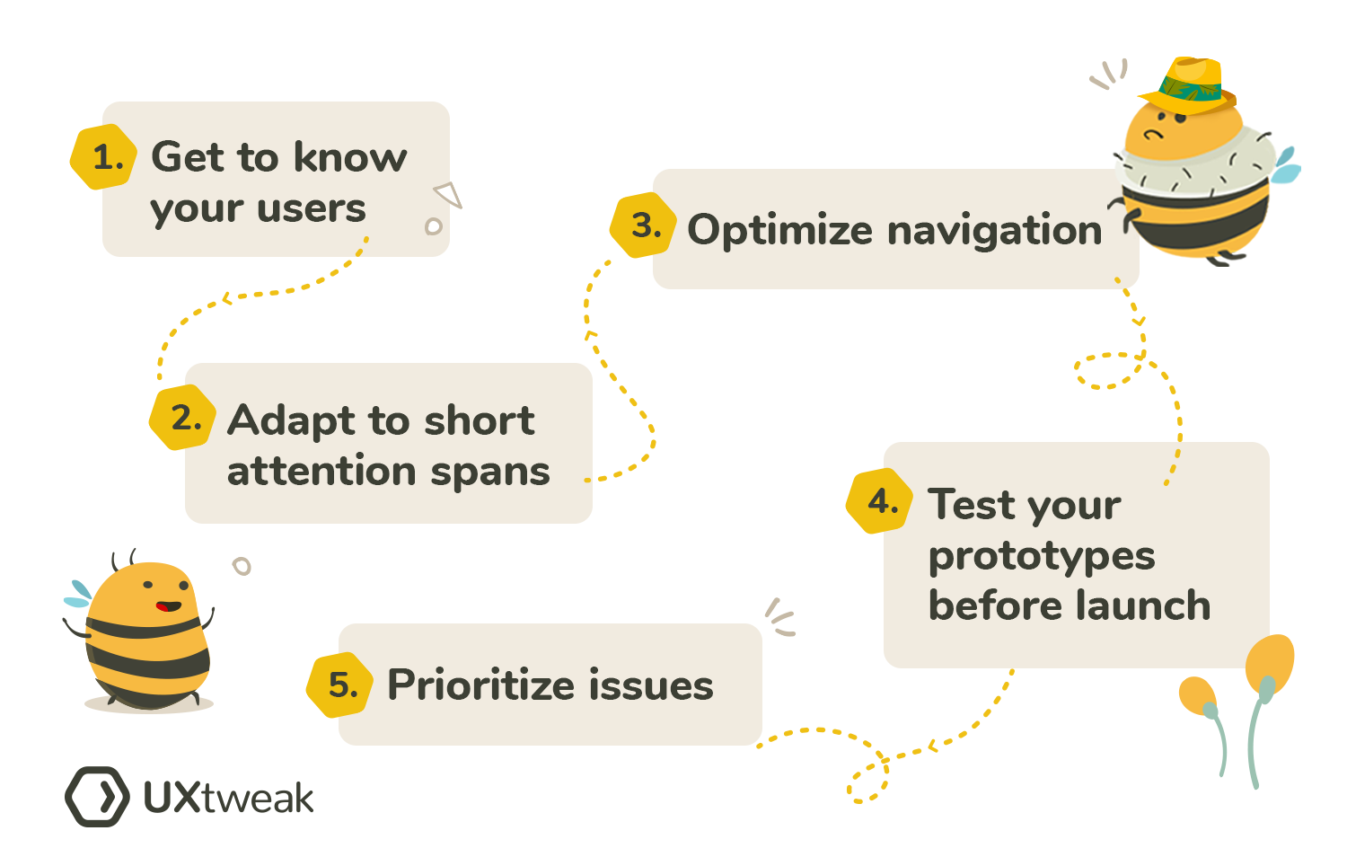
- Get to know your users
- Adapt to short attention spans
- Optimize navigation
- Test your prototypes before launch
- Prioritize issues
Even though there is no one-fits-all approach to creating a new product, there are definitely a couple of best practices that can help you design a better UX. Let’s take a look at each of them in more detail.

Get to know your users
First and the most important thing is to get to know your users, their needs, patterns, expectations and problems. User research is essential for design teams to know what to focus on and create user-centered products.
It can be done in various ways with the help of UX research methods such as: user interviews, surveys, preference tests, first click testing, card sorting, tree testing and others.
Adapt to short attention spans
According to recent studies, the average human attention span decreased to only 8.25 seconds. Therefore, it’s crucial that we adapt modern designs to shorter attention spans, only leaving the information that is relevant for the user. Keep it short and clean, without overwhelming users with tons of content and useless features.
Focus on creating a smooth user flow and supporting users in achieving their primary goals with your product. Remember that users often just scan content, so avoid blocks of text on your homepage and instead try to convey the main information in a short and concise manner.
💡 To ensure a smooth user flow, don’t forget to use a user flow diagram during the design process.
Optimize navigation
Good navigation is the foundation of user experience. If your users can’t navigate the product properly they’ll probably just get annoyed and go to your competitors. Providing a smooth navigation flow, with intuitive labels and categorization is essential for converting visitors into customers.
To optimize the navigation you need to build an Information Architecture based on your users’ expectations and mental models. Start by conducting a card sorting study to find out how people expect your content to be grouped and labeled. Then, based on the obtained information, create a structure that could potentially work for your product. The last step is to evaluate this structure with tree testing, spot problems and optimize for smooth navigation flow.
Test your prototypes before the launch
Another great tip that will save you tons of time and money is implementing prototype testing in the design process. Testing your prototypes allows to spot usability issues early on and fix them before the development. You can run multiple rounds of prototype testing throughout the design process to help you evaluate new design decisions and back up necessary changes with data.
Prototype testing can be easily conducted online with the help of UXtweak Prototype Testing tool. All you need to do is upload a link to your prototype in Figma or Invision. Alternatively, you can just test screenshots of your design. Prototype testing is also available for mobile designs using our Mobile App Testing tool.
Prioritize issues
Our last tip for you is to prioritize issues in their severity. Don’t try to fix everything at once. Often, after conducting a significant amount of usability studies you realize there’s a lot more to improve than you’ve expected. It’s easy to get overwhelmed by the amount of fixes that need to be done.
Prioritizing issues can help to avoid this stress and focus on issues that actually matter, while postponing some of the less severe ones. Usability issues connected to an important task on your website, for example a problem with forms at the checkout stage, is something you need to start working on immediately. However, something as simple as cosmetic issues or non-critical workflow issues can wait.


