Great UX design consists of many things: flawless usability, intuitive navigation, stunning visuals and many others. It’s a real challenge for design teams to succeed at them all and make a truly excellent product that users love.
Let’s take a look at some of the examples from the leaders of the industry who managed to do just that. Below we are going to give examples of 6 websites we all know and love that nailed it in terms of UX design. Apart from UX design examples, below, you’ll find a list of must-visit websites that will help to inspire you for your next UX design project.
Why did we choose the UX design examples below?
We wanted to show you great UX on some of the giants of the industries. Product design of the brands we all love and use – what could possibly be a better example? UX can make or break the whole brand experience and the companies below know that. That’s why they invest in UX design and research, and provide their users with great functionality and seamless experiences.
They are all different brands that provide people with various services and products. But there’s one thing they all have in common – their customers love them. Below we are going to try and understand why exactly they’re great and what lessons you could learn from them to apply in your own UX design process.
6 great UX design examples:
- Notion
- Spotify
- Airbnb
- Nike
- Revolut
- Skyscanner
Spotify
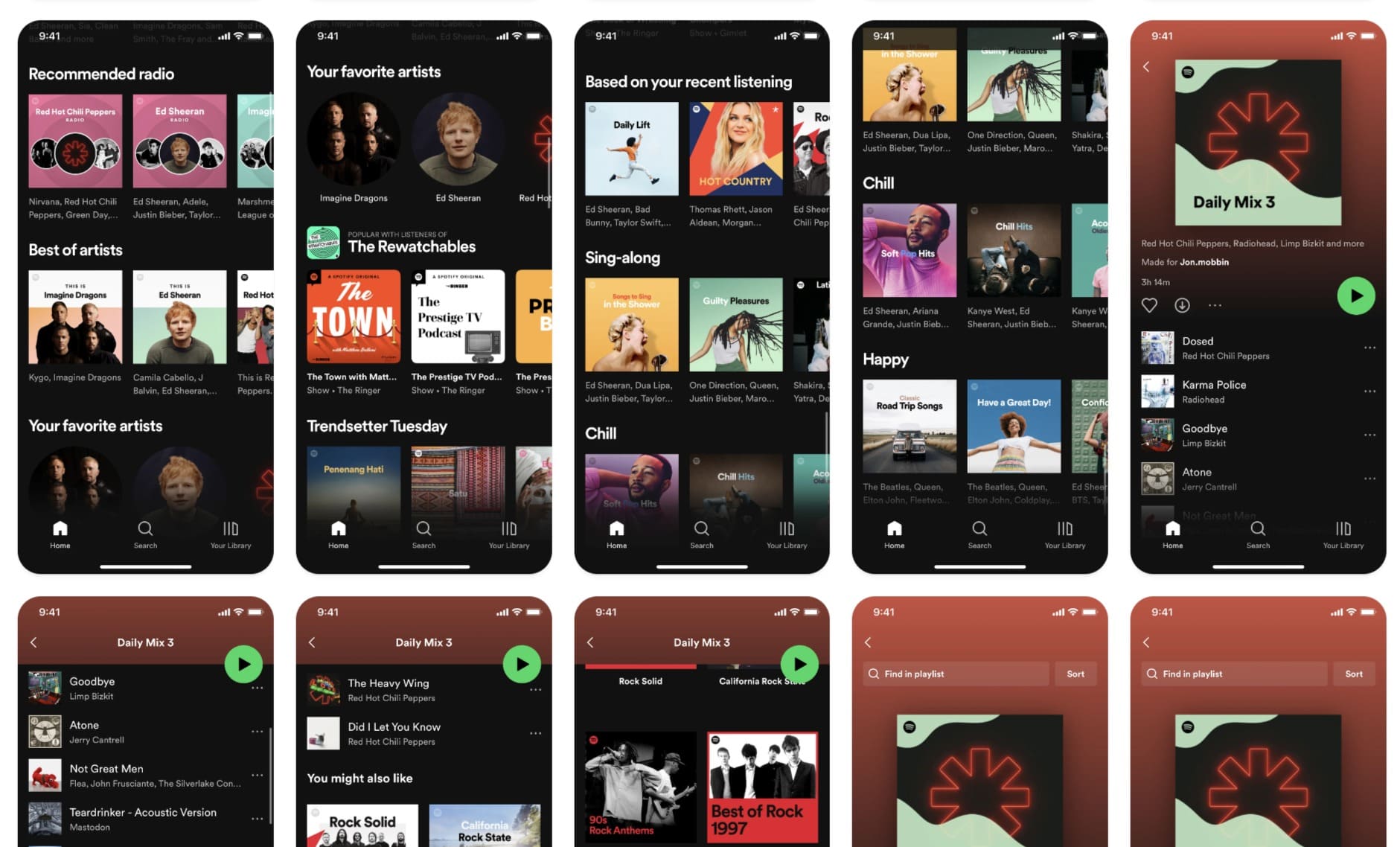
Spotify is a music streaming service that has been in the heart of its listeners for decades. They are loved by their users and there is no question why. When you compare Spotify to some other music streaming services like Apple and Amazon Music, Deezer, SoundCloud and others, it’s perfectly clear why they stand out.
Spotify made it their priority to focus on personalization and ease of use and you can see it in their interface. Their designs are clean, user-friendly and stylish and they never fail to deliver on new exciting features. Spotify perfectly combats the biggest problem of the average listener: absence of new music to tune into.
They offer tons of playlists with recommended songs just for you, allow you to easily look for songs that are similar to the ones you just liked and constantly update your weekly playlists in different genres. Not to mention that Spotify never fails to entertain their users with new additions like Spotify Wrapped and other great features.
They are a great example of user-centered UX design that offers a great amount of features without making it look overwhelming.
Airbnb
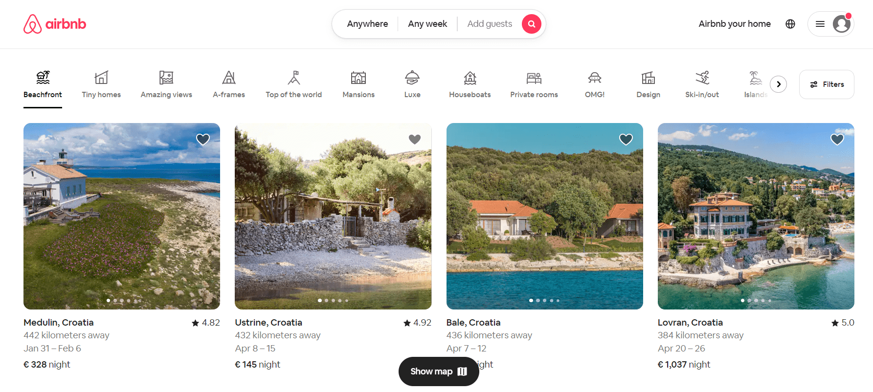
The example everyone will probably agree with is Airbnb website UX design. They have definitely done their user research as this website contains everything you might think of when it comes to booking an accommodation.
Starting out with their homepage – a thorough selection of places to visit near you, even if you didn’t plan on taking that trip! What a great way to use the first page of your website. Their interface is minimalistic and clean but still shows all the information you need: price, location, ratings and even the ability to scroll through the photo gallery without having to open any specific offer.
They also offer their users a unique search experience, providing an interactive map of the city they are planning to visit with all the places available on it. And most importantly, tons of filtering options, from price to details like an apartment being pet-friendly or having a parking lot.
Nike
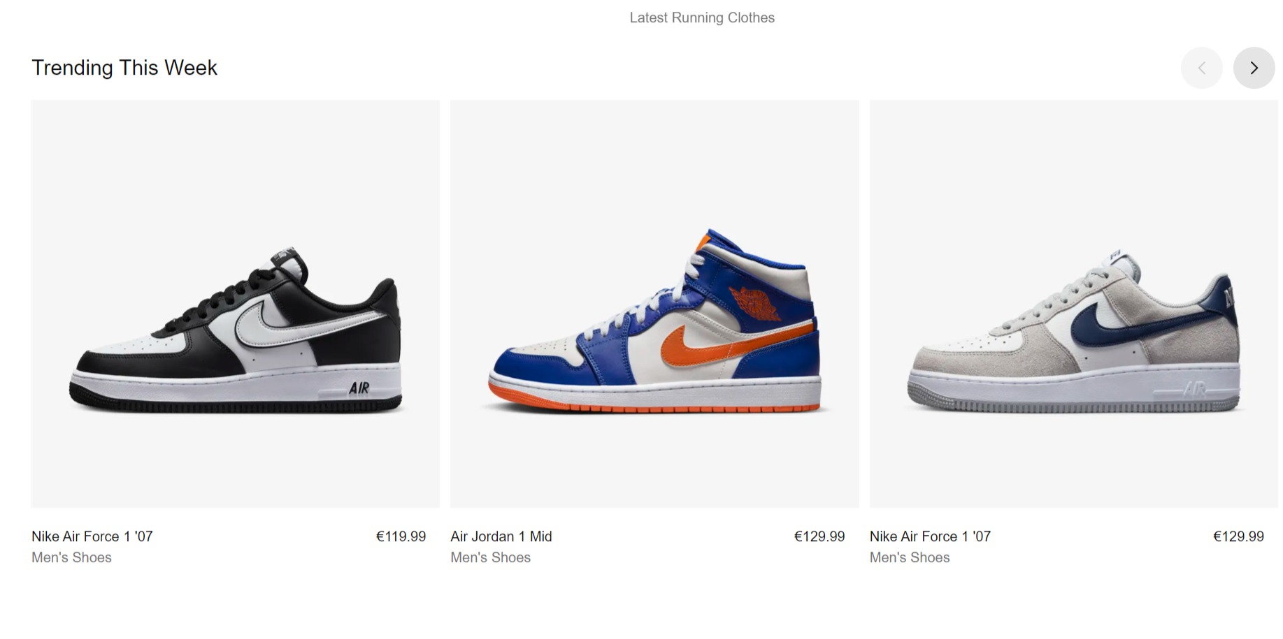
Nike is a perfect example of seamless and intuitive e-commerce UX that offers nothing more than an online buyer needs. Their menu structure is extremely transparent and easy to navigate, even with a huge amount of product categories they sell. Their homepage is constantly updated with new high-quality photos and engaging videos and the website overall is extremely aesthetically pleasing.
Products in the category pages are displayed with large photos that perfectly demonstrate every little detail to the customer. The product pages are also very intuitive and make it easy for anyone to pick the right size, find delivery and returns info as well as other items to complete the look.
Overall, Nike is a great UX design example of an e-commerce website, a smart use of proximity and the sizes of items!
Revolut
Who thought banking could be fun? Definitely not us, but Revolut proved everyone wrong with their outstanding UX design. Their main focus is on personalization and customization. Revolut mobile app allows users to change and customize their background design, icons and other design elements. Not to mention, the app greets you by name.
They implemented tons of useful features but one of the most loved ones is their money transferring system. Sending money to each other through Revolut is not just extremely easy but also fun! You can text and add funny GIFs to the dialogue.
From the technical side, the app is very easy to navigate, and their UX writing is on point. Revolute uses clear language that’s easy to understand for everyone and helps you conduct money transfers in seconds, without any frustration.
A real example of how you can turn a boring money transferring app into a real entertainment.
Skyscanner
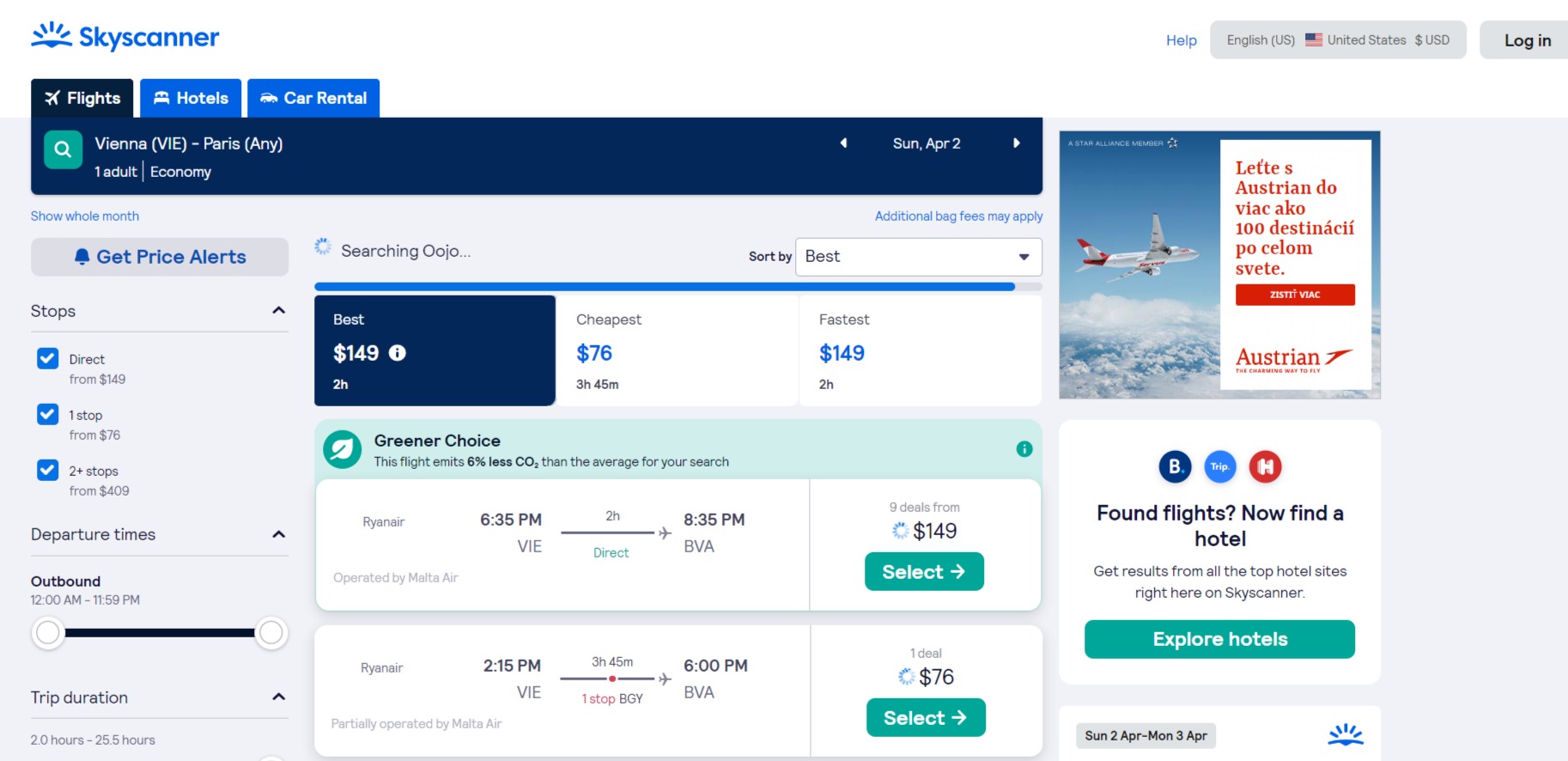
Skyscanner is a go-to website for many travelers around the world for a reason. They make it easy to look for the best prices and gather all offers at one place, making it easy to access and compare your options. Search is their primary feature and this company did a great job on designing it.
The platform allows you to either choose specific dates or the whole month and compare prices for each day. For those who don’t know where to go there’s an option to choose “Anywhere” as your destination. You can also not limit yourself to specific cities but instead choose the country and see which city you can visit for a better price. Skyscanner also has an “Airports nearby” feature which also comes in handy when planning your trip.
They are also great when it comes to keeping a user updated. When a specific search occurs it may usually take a couple of seconds before they can show you all of the options. Instead of making the users wait in confusion, they show a progress bar that clearly indicates what’s going on and how far in the process you are.
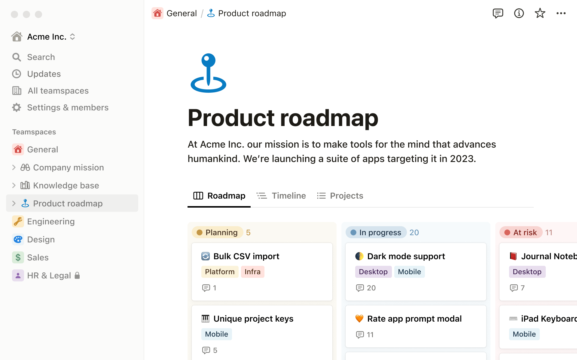
Notion
Notion is an app that manages to help people organize tons of information in a simple yet accessible way. This platform is famous for its minimalistic design and great functionality. It gives users the ability to create a workflow that is perfectly tailored to their needs and therefore streamlines productivity.
This app can replace dozens of others just due to its versatility and simplicity. And it really is for everyone! You may find it just as useful for taking quick notes and making lists as organizing and making sense of large blocks of data. The interface makes it extremely easy for you to customize the app and its layout to your needs, which is probably the reason why so many people all over the world love it so much.
UX design inspiration: where to look for it?
Now that you’ve seen examples of good UX design, it’s time to start creating your own. But what if you have no idea about how your ideal design should look like. We all need a dose of inspiration from time to time to keep us going and generate new ideas.
Luckily, there are tons of UX resources online where you can find UX design inspiration, look at the works of professionals and come up with fresh concepts for your new project! Let’s take a look at some of the go-to websites among designers to find UX design inspiration:
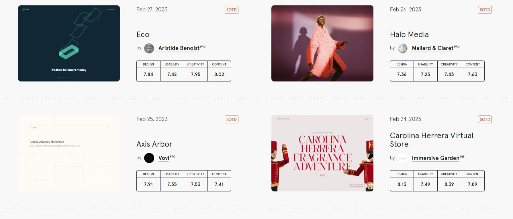
Awwwards
Awwwards is a website where you can find freshly curated UX design inspiration on a daily basis. Every day a team of experts in the design field chooses the website of the day and rates it based on the specific criteria like creativity, functionality, user experience and others.
Apart from this, you can find collections of previously awarded websites and inspire from them as well as explore Awwwards blog with tons of articles on all things design and UX.
Dribble
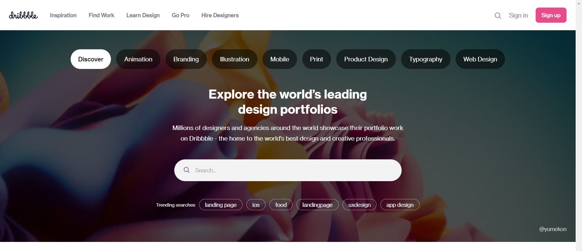
A website that every designer knows, loves and visits frequently to find design inspo. Platform, where creatives from all industries share their work, Dribble has been around for a long time and became a go-to place for many of us to find fresh ideas.
In terms of UX design you may find some unrealistic masterpieces that are not supposed to be functional, just beautiful. Dribble is a place to inspire and look at creative interfaces, so don’t look for usability there.
Behance
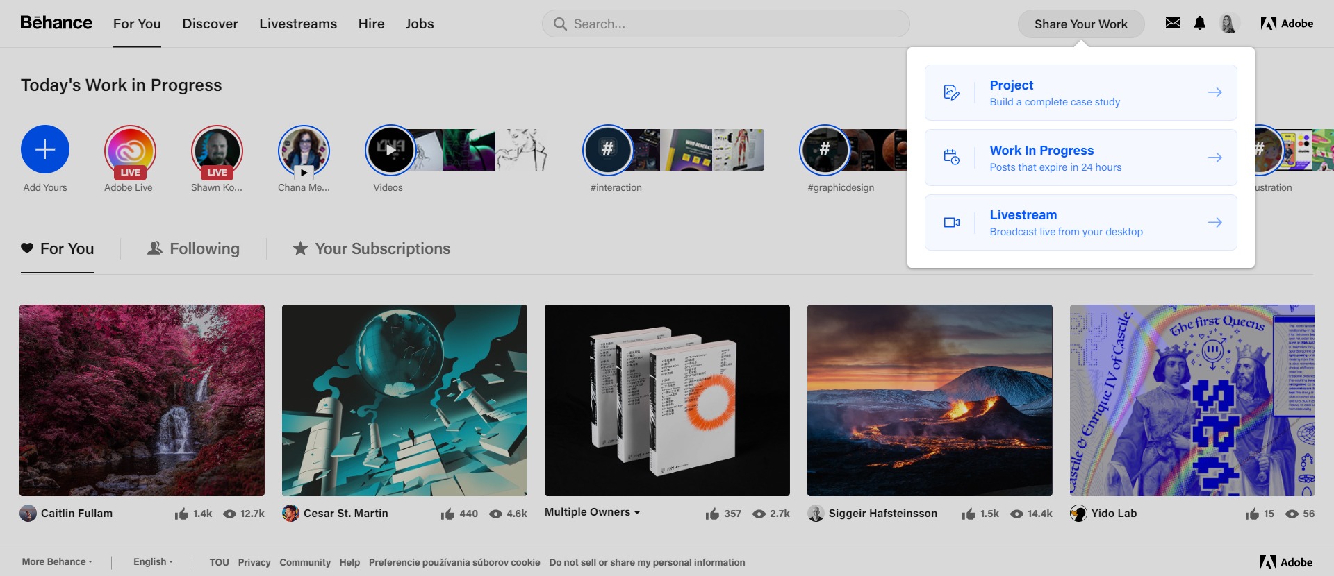
Similar to Dribble, Behance is more of a portfolio website where designers can showcase their works, single pieces or whole series of designs.
You can find works on all kinds of topics here: design, fashion, illustration, industrial design, architecture, photography, fine arts, advertising, typography, animation, sound effects, and more. They also have a dedicated job board where employers can hire creatives.
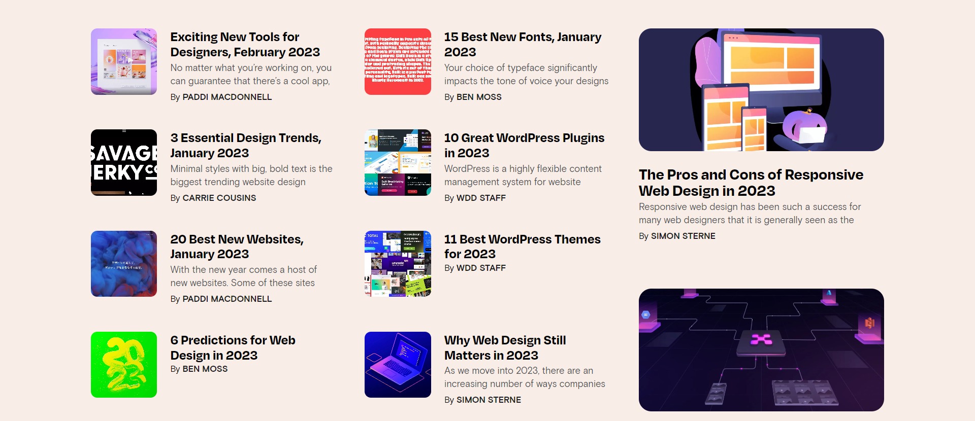
Web Designer Depot
Web Designer Depot is a curated and constantly updated list of UX design resources, articles, design trends and so much more! They also post tons of freebies you can make use of and constand updates on new web design trends, guides etc.
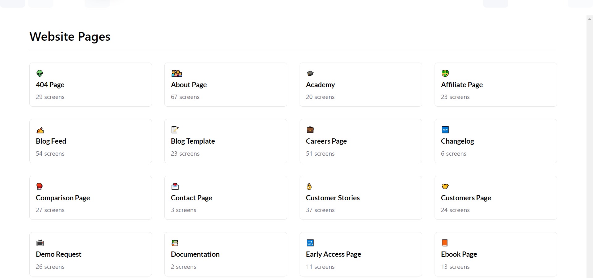
Saasframe.io
Saasframe.io gives users access to tens of thousands of samples that may be used as guides when producing professional-quality design and copy for SaaS products. It’s not only a source of inspiration but also a place full of templates to borrow for your next design project.
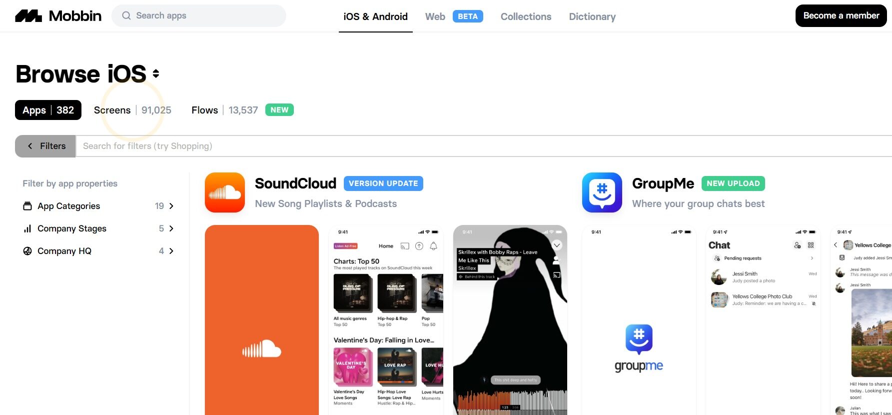
Mobbin
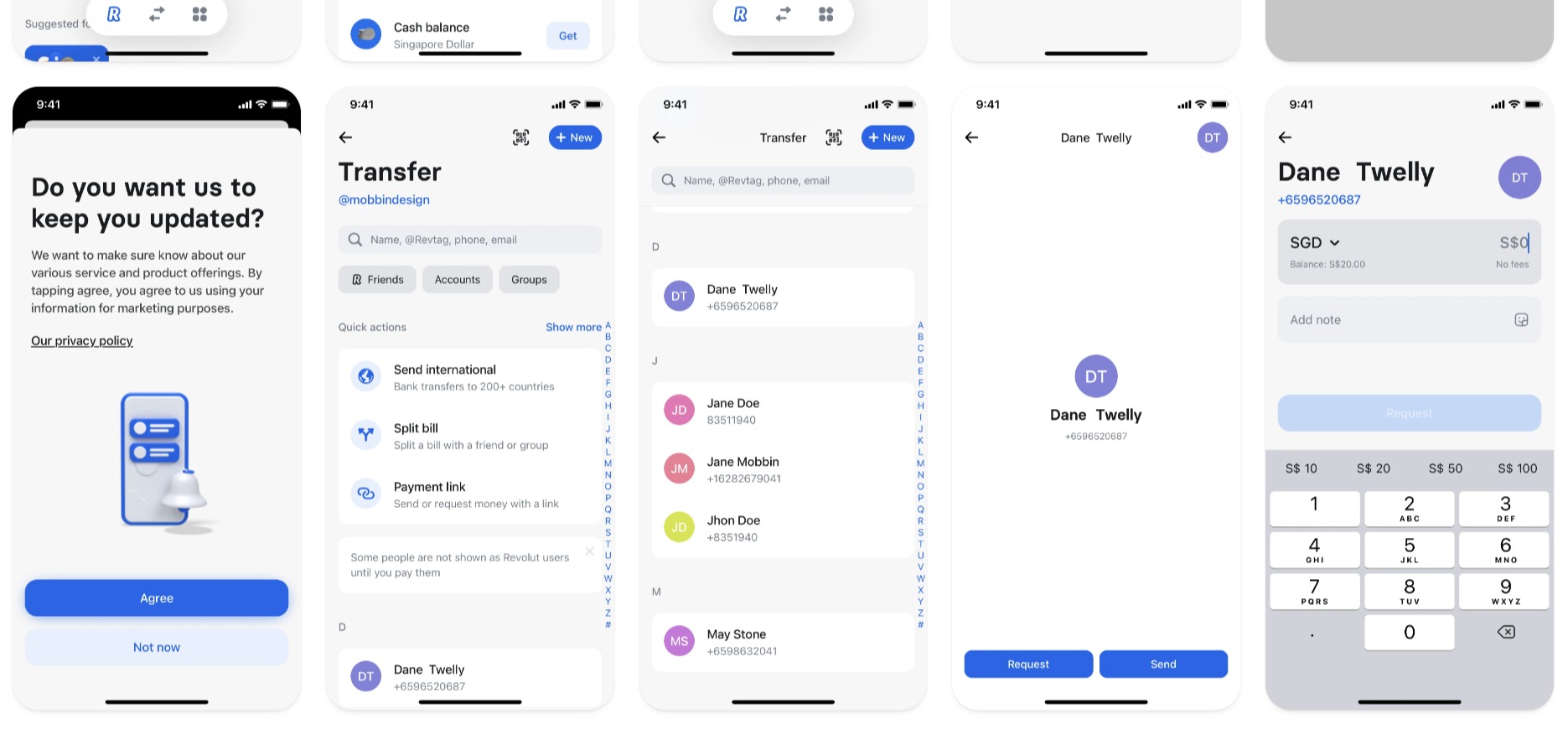
Mobbin is a tool that allows you to skip hours of research on the lookout for inspiration with a library of 100,000+ fully searchable mobile & web screenshots. On Mobbin you can find screenshots of thousands of apps from IOS and Android with great UI and inspire from them!
Bestfolios
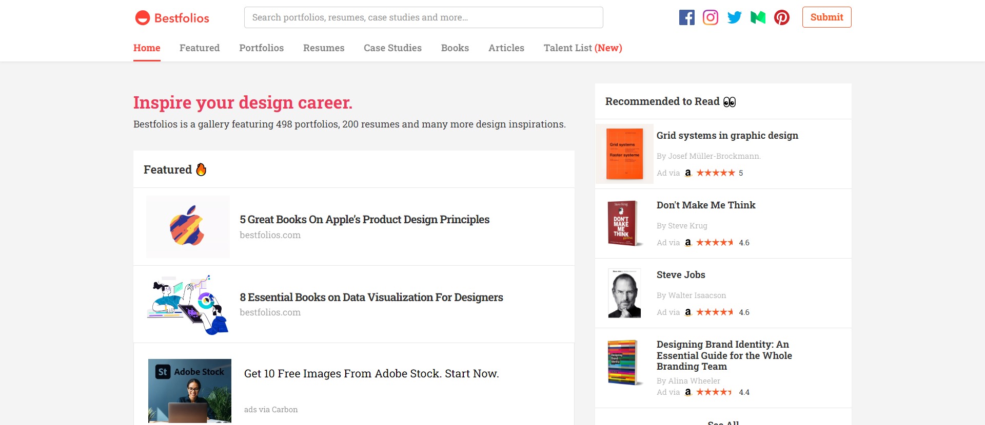
Bestfolios is a gallery featuring 498 portfolios, 200 resumes, case studies and many more design inspirations.
