
User journey maps come in all shapes and sizes, depending on the type of product, persona and the goals you’ve defined for the research project. We understand it can be confusing to come up with your own structure suitable for your specific use case. That’s why we gathered 15 different user journey map examples to make sure you have something to look up to when working on your own map.
It’s always easier to create something based on the examples of professionals who’ve already done it!
What is a User Journey Map?
A user journey map is a visual representation of the steps a user takes to achieve a specific goal when interacting with a product or service. It highlights the user’s experience, emotions, pain points, and interactions at different stages of their journey. If you would like to learn more about user journey maps, please go to the first section of this guide.
In the examples below, we present user journey maps from well-known companies, as well as those categorized by different industries:
- NN/Group
- Spotify
- Hubspot
- UXPressia
- Indian Railway
- TurboTax
- Amazon
- Netflix
- Starbucks
- Government Agencies
- Healthcare
- University
- Banking
- Marketing
- Telecommunications
Example 1: NN/group
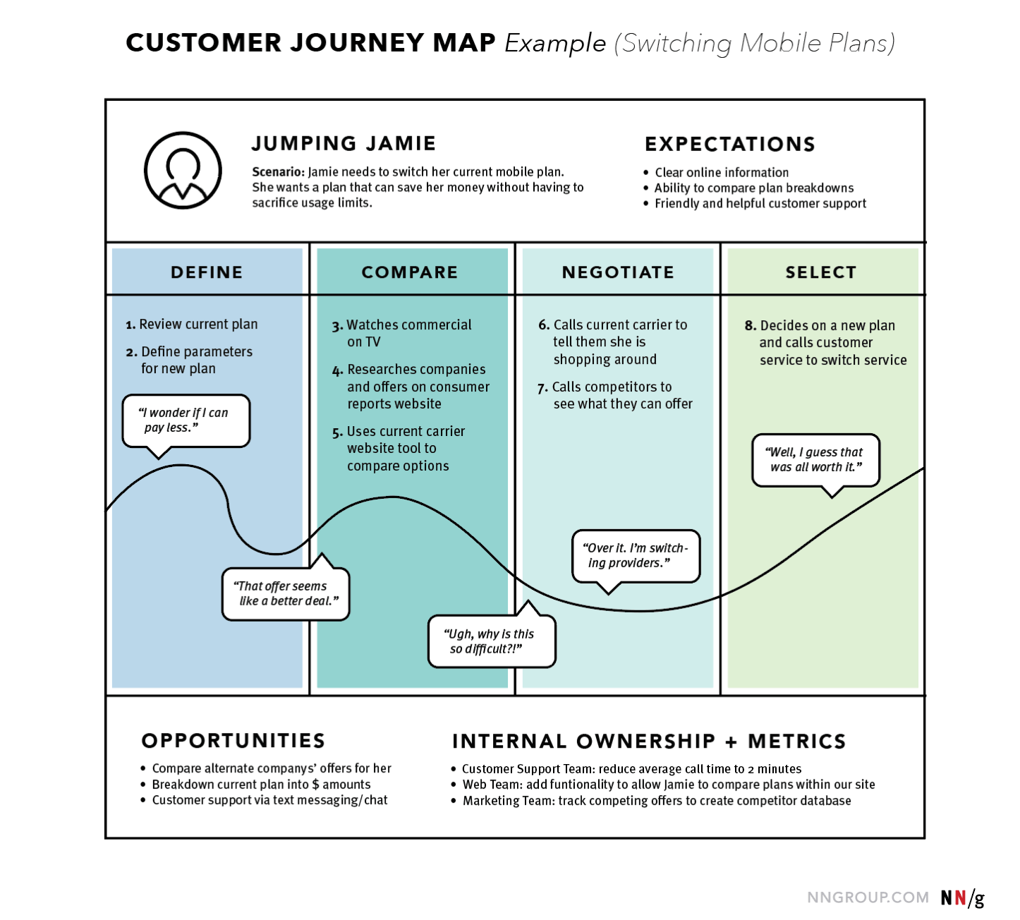
Source: NN/group
We chose NN/group’s user journey map as the first example for one reason. It’s very simple and easy to recreate and can serve as the most basic template with all the crucial components inside. In this particular case, we’re looking at the user journey map of the Jumping Jamie, who is looking to switch her mobile plans in order to save money.
The map perfectly outlines the 4 user stages she goes through: define, compare, negotiate, select.
We can see that at each stage Jamie completes different steps on the way to her final goal. We can also see the feelings she has along the way and the line which represents her emotions, going from the low to high points, depending on her satisfaction with the experience. The bottom of the map serves as the conclusion, defining the opportunities for improving the customer journey and internal ownership.
What we can learn from this example: This map shows the emotional ups and downs a user faces when switching mobile plans, showing that even simple decisions can cause frustration if the process is complicated.
Example 2: Spotify
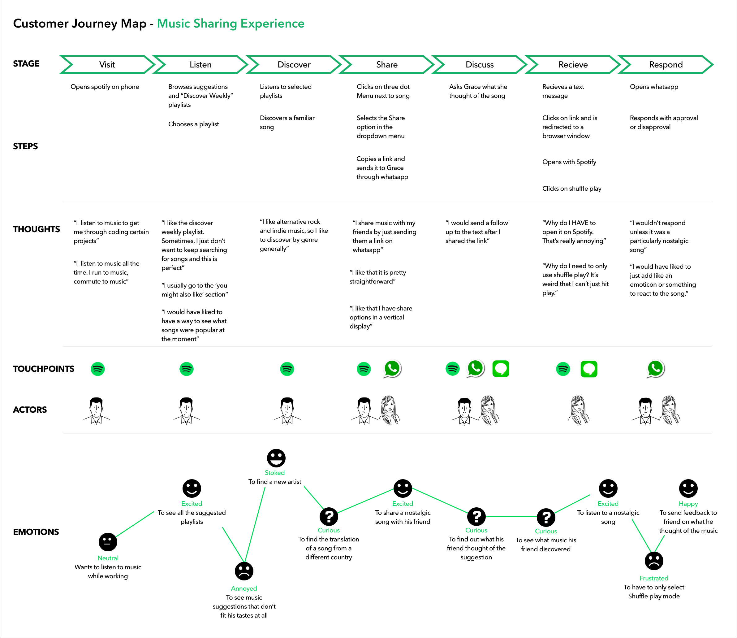
Spotify’s map for improving their music sharing experience is a great example of a B2C customer journey map. It was created as a part of a design project with the goal to add a music sharing feature that would allow listeners to send each other playlists and songs either within the platform or using other platforms. The project included customer journey mapping together with developing a persona as a part of the research stage. Check out the full Spotify case study to learn more.
As we can see on this map, there are a lot more stages a typical Spotify user goes through. Their thoughts and actions are described a lot more detailed and there are also additional sections such as touchpoints and actors. This map helped the design team understand at which point and why users get motivated to share music with each other. One of the key insights was that users are much more likely to share a song when the sharing feature is visible to them.
Meghana Bowen, a UX designer who worked on the project talks about pain points they uncovered: “The biggest pain points discovered during the research stage was that the participants were worried about being judged for their music habits, as well as, most users were not aware of a share functionality existing.”
What we can learn from this example: This map gives a detailed look at how users discover, share, and discuss music, highlighting key moments of excitement and frustration. It shows how important visible and easy-to-use sharing features are to motivate users to engage.
Example 3: Hubspot
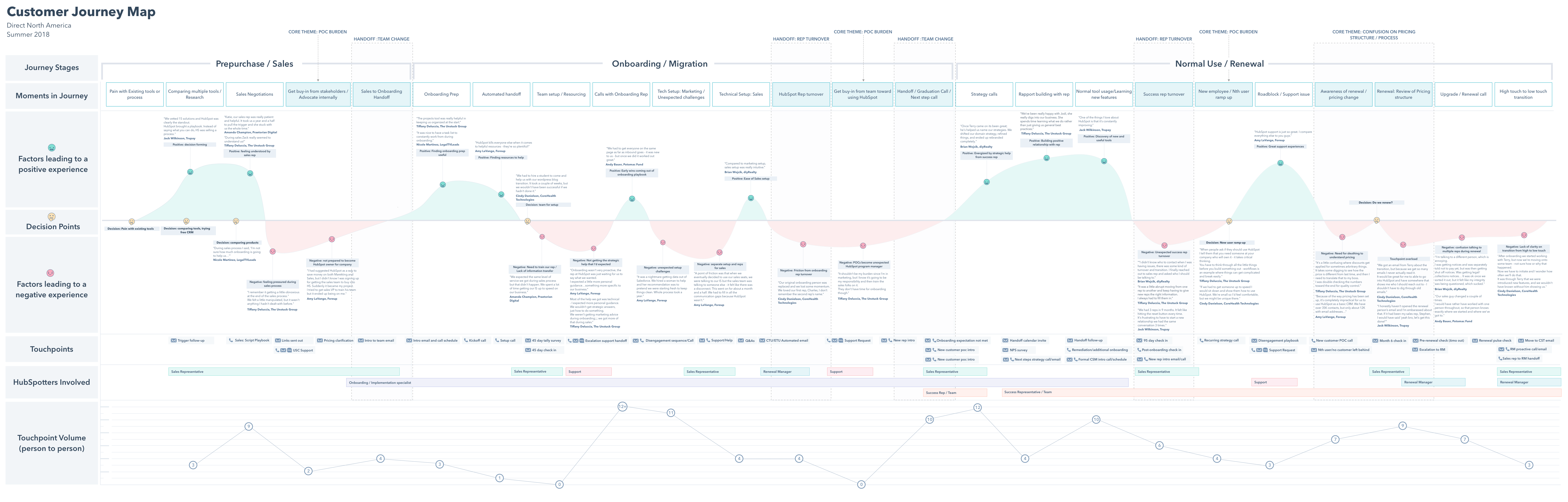
In 2018 Hubspot created their own customer journey map and wrote a whole article about it providing you tips to create your own.
They chose a classical linear structure and used color-coding to make it more readable. A great idea was to add testimonials of their actual customers dealing with the product during the user research stage. This helped to empathize with them better, make existing problems feel more real and urgent and justify the data about their feelings.
It’s also a great thing to add for those who you’ll be presenting your user customer map to. These people will not be completely familiar with the research process behind it, but reading the testimonials could help them get more context on what’s going on at each stage of the journey.
What we can learn from this example: Including testimonials is also a smart move for presentations, as it gives people unfamiliar with the research behind the map valuable context to better understand each stage of the journey.
Example 4: UXPressia
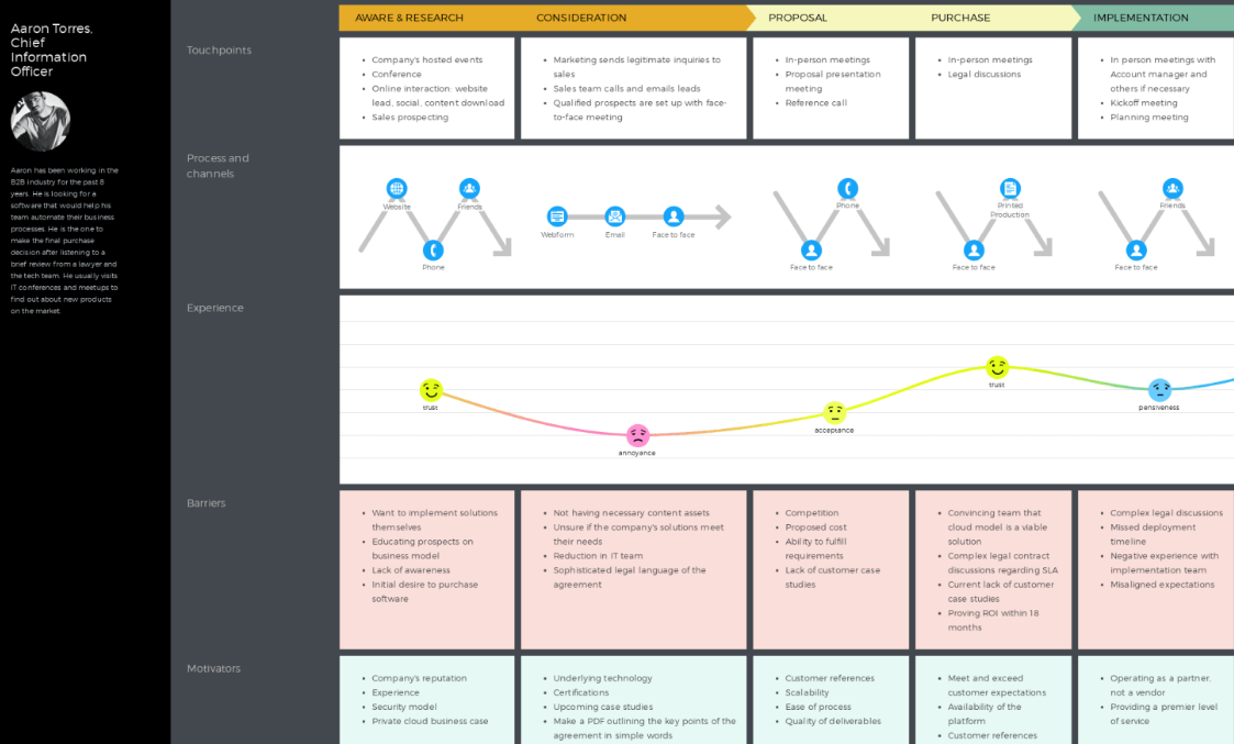
Another user journey map example, this time by UXPressia. It perfectly represents the B2B customer journey, outlining the stages a user goes through while making a purchase, from awareness to bonding or detachment.
UXPressia’s user journey map also includes 2 handy sections: barriers and motivators, that they describe under each stage. We can see that while there are no detailed emotions described at this map (as in the previous ones, for example), it’s still informative due to the motivators and barriers sections.
That again proves that customer journey map templates can and should look differently, as long as they are informative and clearly represent your user’s POV.
What we can learn from this example: This example proves that user journey maps can vary widely in format and style, as long as they effectively capture and communicate the user’s point of view.
Example 5: Indian Railways
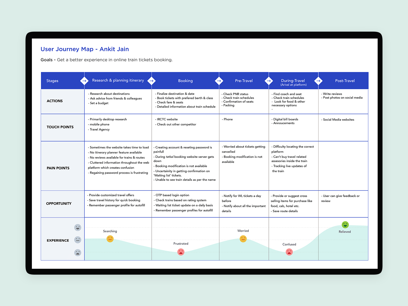
Our next example will be a user journey map created by Deepika Sinha from a research case study found on Behance. The study was conducted with a goal of improving the mobile UX of an Indian Railway app. You can check out the whole case study here.
This is a great example of how you can make an informative user journey map while still keeping it clean, visually appealing and not scary to read. The map shows the experience of booking tickets through the app, describes the pain points a user goes through and the opportunities for designers to improve the experience.
What we can learn from this example: This user journey map highlights several pain points during the ticket booking process, visualized through emotions like frustration and confusion. The map clearly outlines opportunities to improve, such as adding login options and better ticket notifications, which can ease user frustration and enhance the overall experience.
Example 6: TurboTax
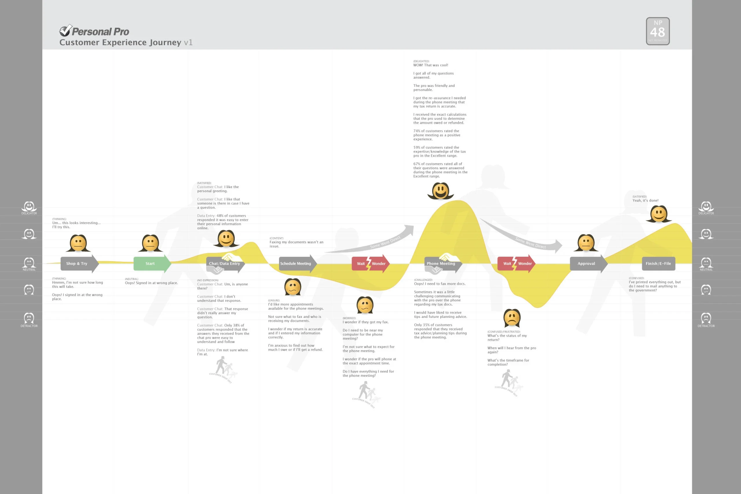
In 2006, the Intuit product team was developing a new tax product called Personal Pro. To better understand the customer experience, they created a customer journey map that visually represented emotions, pain points, and overall interactions across a timeline. This journey mapping example was instrumental for the team to identify areas where customers were facing challenges, allowing them to address these issues and improve the overall experience.
Additionally, the team wanted to understand the journey of tax professionals working with customers. They used the same approach to develop a user journey diagram example to represent the tax professional’s experience. This map, designed to highlight key moments in the journey, became a valuable user journey mapping example used throughout Intuit to improve future product iterations.
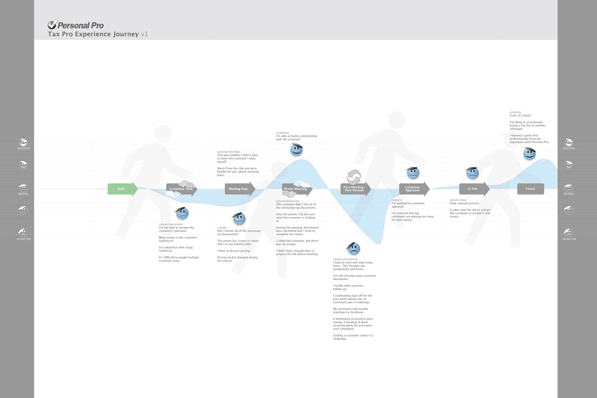
What we can learn from this example:It shows how mapping both the customer’s and the professional’s experiences uncovers specific pain points and emotional highs and lows. This dual perspective helps teams target improvements more precisely, making complex processes like tax filing less stressful and more intuitive for everyone involved.
Example 7: Amazon
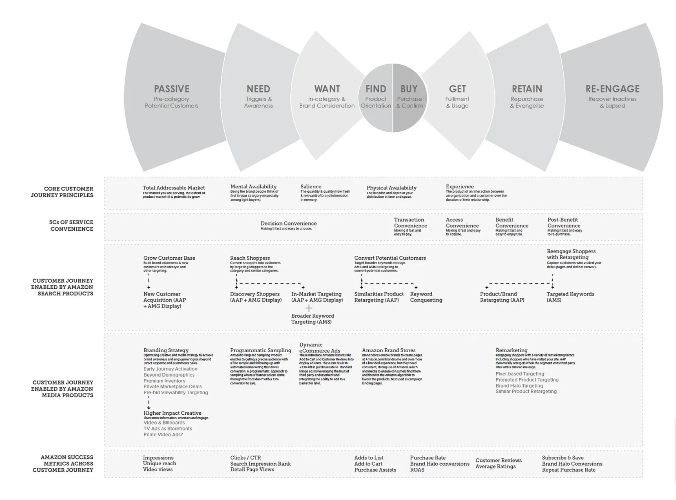
Amazon, one of the largest e-commerce platforms globally, takes great care in developing its customer journey map to understand and guide customers through its extensive sales funnel. While Amazon’s customer journey map is quite detailed and complex, it effectively breaks down the customer experience into manageable stages, such as passive, need, want, find, buy, get, retain, and re-engage. At each stage, Amazon tracks important success metrics like impressions, CTR, add to cart, purchase assists, and repeat purchase rates.
What we can learn from this example: This map shows how Amazon breaks down the customer journey into detailed stages, from passive potential customers to re-engaging lapsed ones. It highlights how convenience at every step—decision, transaction, access, benefit, and post-benefit—is central to their strategy. The map also illustrates how Amazon uses a variety of targeted media and search products tailored to each stage, making the experience highly personalized. By clearly linking marketing tactics to specific journey phases, this example reveals how aligning tools and messages with customer needs can drive better engagement and sales.
Example 8: Netflix
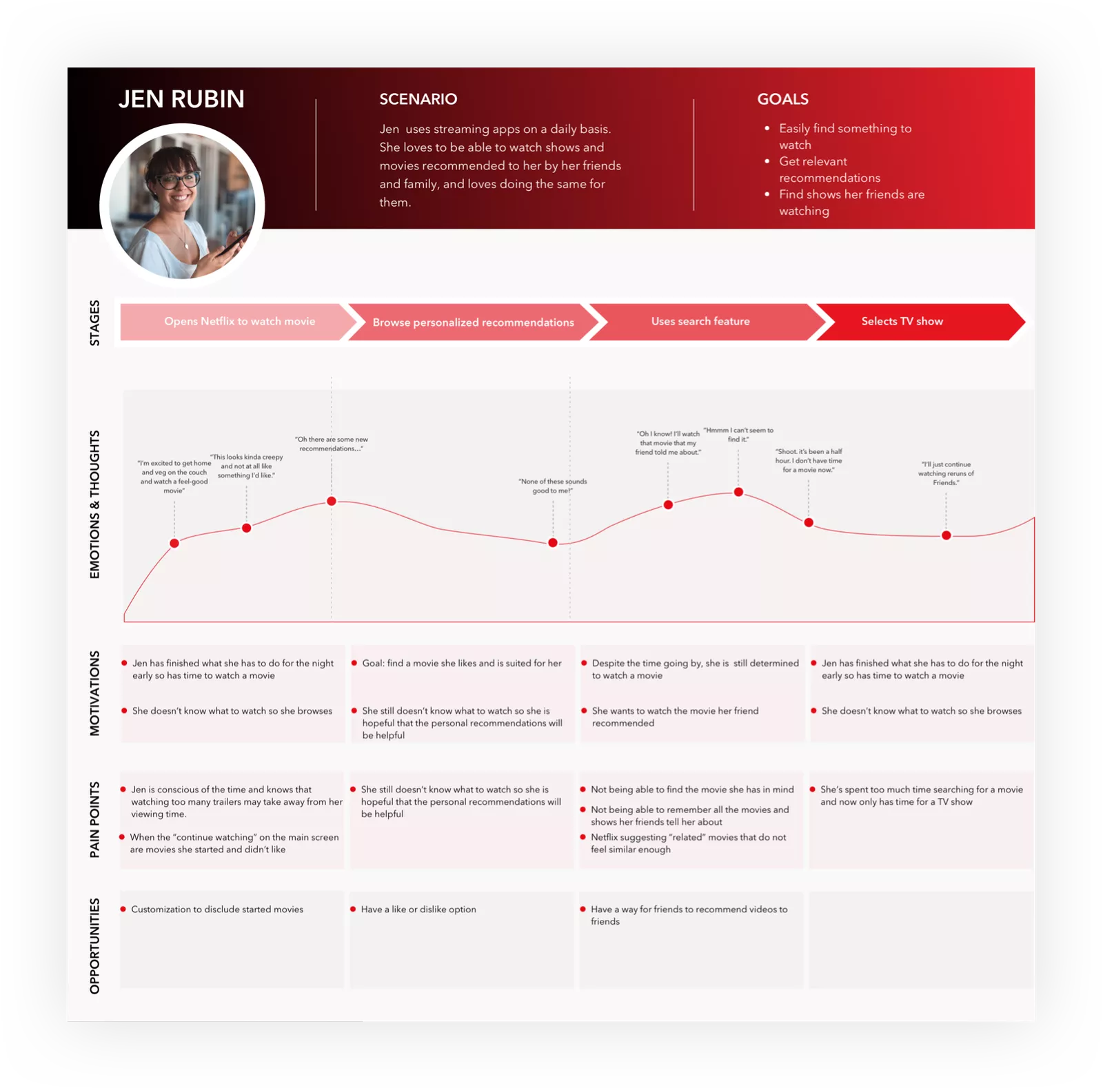
Netflix’s customer journey map illustrates the steps a user, like Jen (fictional persona), takes to watch a show. The map shows Jen’s actions, such as disregarding Netflix’s recommendations and manually searching for a movie, highlighting an opportunity for Netflix to improve its algorithm. It also identifies Jen’s pain points, motivators, and emotions, providing insights into how to enhance the user experience.
What we can learn from this example: This example highlights common frustrations users face when trying to find something to watch, such as irrelevant recommendations and difficulty locating specific shows. The emotional curve clearly shows how user excitement can quickly turn into confusion and disappointment. It also points out valuable opportunities, like adding better customization options and ways for friends to share recommendations. This map reminds us how crucial it is to streamline discovery and keep the user engaged throughout their viewing journey.
Example 9: Starbucks
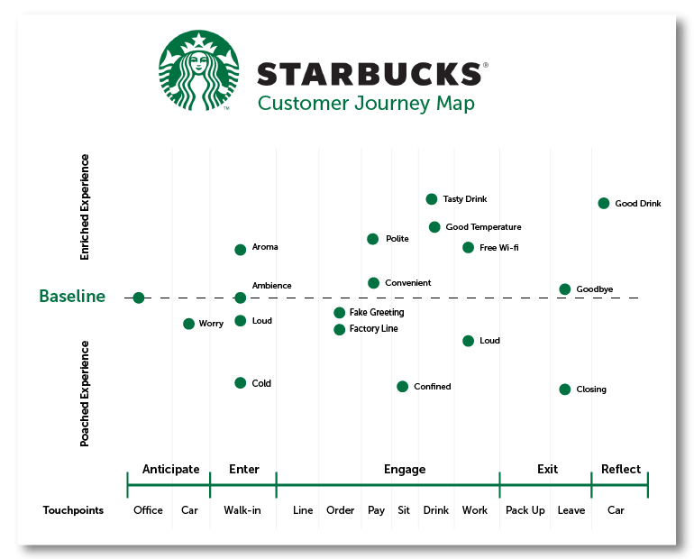
This customer journey map highlights a repeat customer’s experience at Starbucks, tracking various touchpoints from arrival to departure. The map breaks down Eric’s journey into stages like “Anticipate,” “Enter,” “Engage,” “Exit,” and “Reflect,” showing his feelings and reactions at each phase.
What we can learn from this example: Every sensory detail plays a role in shaping the customer’s experience – from the welcoming aroma and cozy ambience to the temperature and background noise. Positive touches like polite service and convenient order flow lift the experience, while moments like fake greetings or crowded spaces can pull it down. This map highlights how even small moments across the visit influence overall satisfaction and the likelihood of return visits.
Example 10: Government Agencies
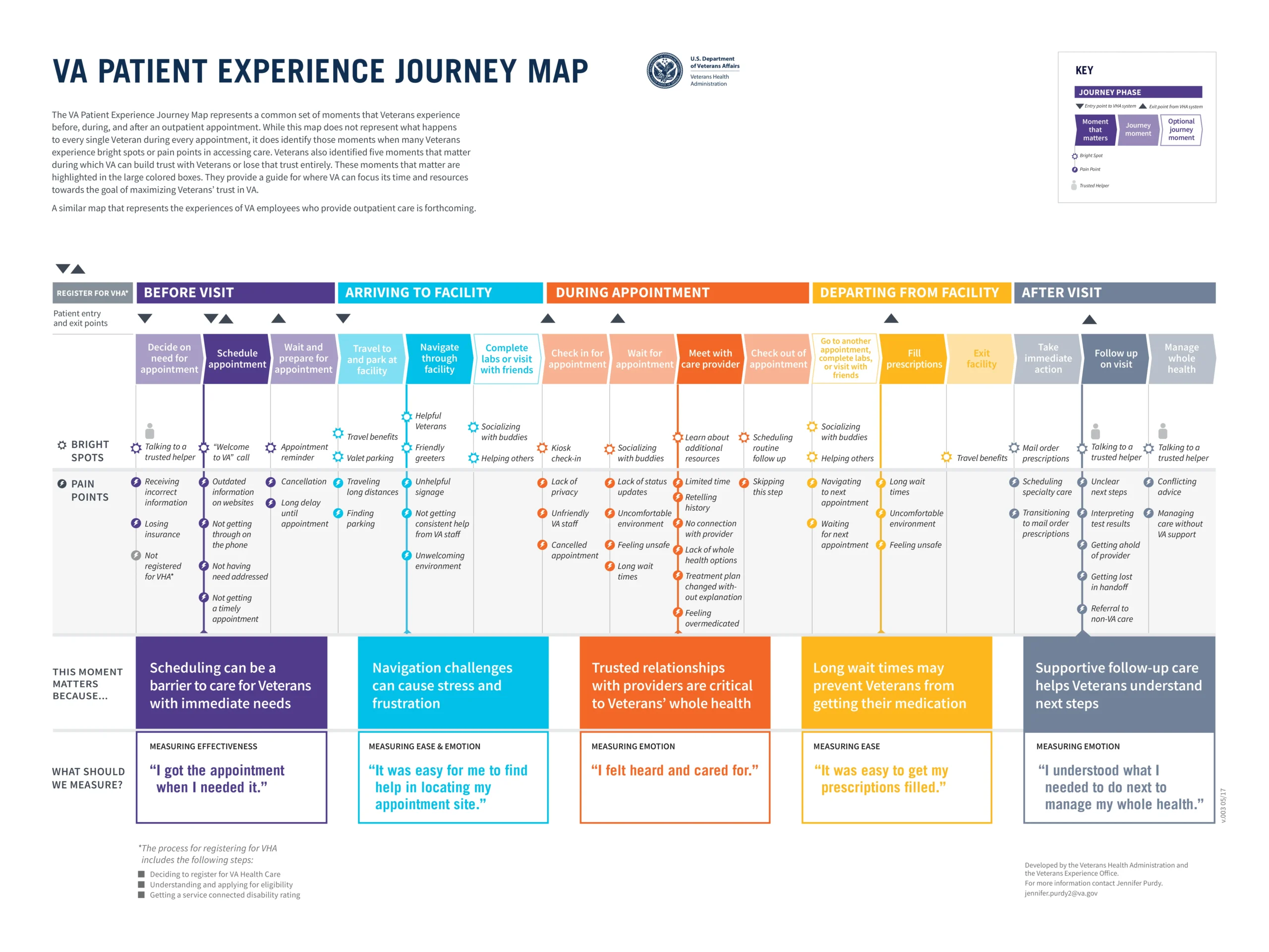
Government services often face challenges when it comes to being user-friendly and easy to navigate. For example, the U.S. Department of Veterans Affairs used journey mapping to focus on the patient experience in VA hospitals. The map visualized each step veterans go through, capturing their emotions, thoughts, and pain points throughout their interactions with the healthcare system. This allowed the team to pinpoint areas for improvement and find ways to enhance the overall patient experience.
What we can learn from this example: In the case of the VA Patient Experience Journey Map, the map clearly differentiates between “bright spots” (positive moments) and “pain points” (frustrations), such as issues with scheduling, long wait times, or navigation difficulties within the facility. This method can be especially useful in pinpointing areas that require immediate attention, while also reinforcing the moments that work well and should be maintained.
Example 11: Healthcare
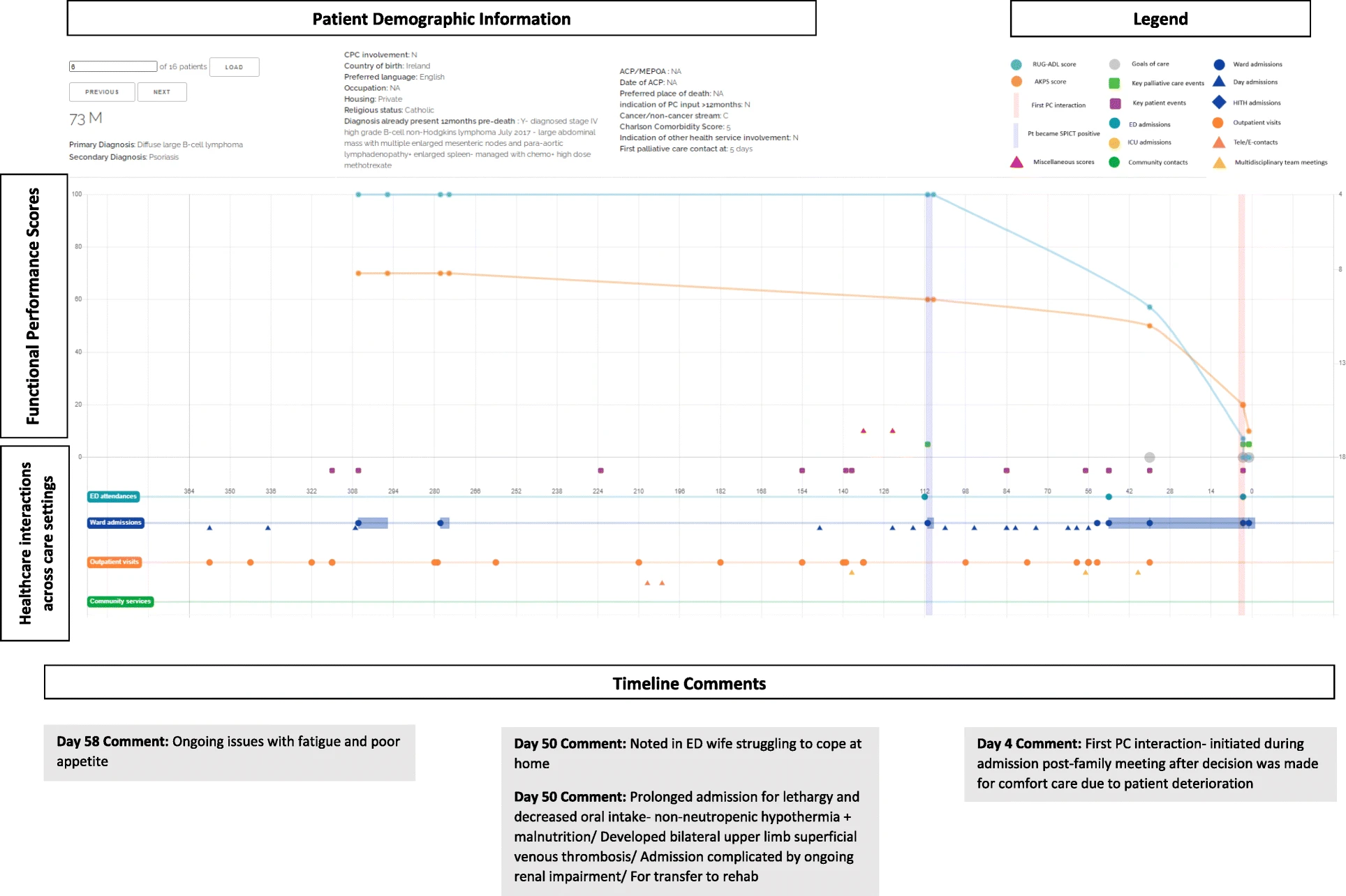
A specific example of user journey map in palliative care demonstrates the innovative use of journey mapping. In the case of a 73-year-old male patient with lymphoma, the journey map visualizes his healthcare interactions over the final year of life, including key moments like the identification of palliative care needs using the SPICT tool and the initiation of specialist palliative care. The map highlights critical pivot-points, such as the missed opportunity for earlier community palliative care support and the delayed referral to specialist care just days before the patient’s death. By showing these gaps, the journey map helps healthcare providers identify moments where care could have been improved, ensuring a more proactive and patient-centered approach to care in the future.
What we can learn from this example: Journey mapping in palliative care uncovers crucial moments and gaps where earlier intervention could improve patient outcomes. This example shows how tracking functional scores alongside healthcare interactions highlights opportunities to provide more proactive and personalized support.
Example 12: University
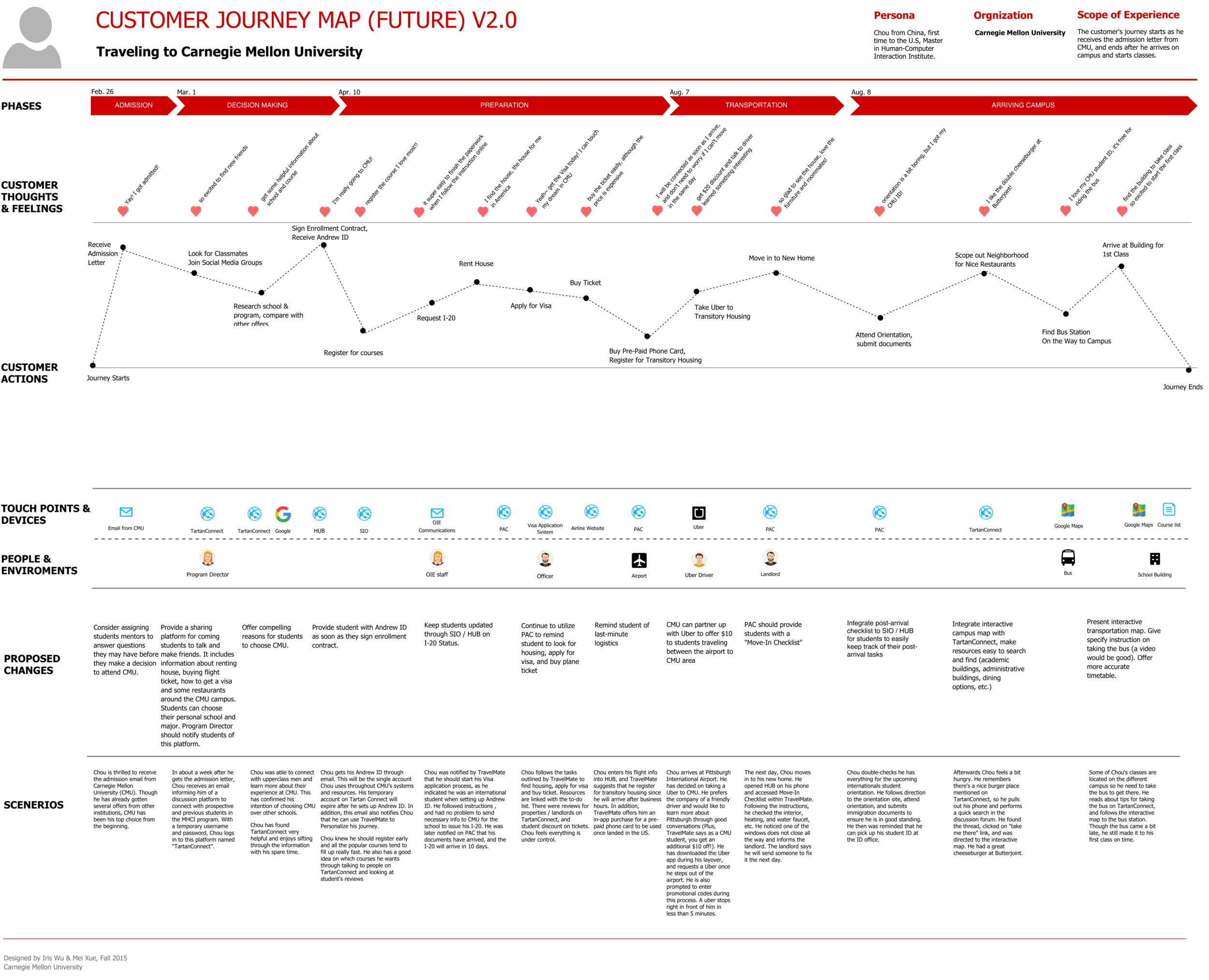
This customer journey map, designed by Iris Tong Wu, represents a future state customer journey for students traveling to Carnegie Mellon University. The map outlines the ideal experience for a prospective student coming from overseas (e.g., China) to the university, breaking down the journey into different phases starting from Admission and continuing through Transportation and Arriving on Campus.
What we can learn from this example: This example shows how a well-structured future state customer journey map can help identify key touchpoints, emotional moments, and areas for improvement to optimize the overall experience for students.
Example 13: Banking
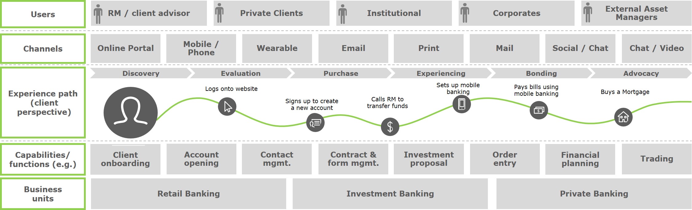
This customer journey map, created by Deloitte, shows the steps a client takes with a bank, from discovering the service to becoming a loyal customer. It covers important stages like signing up for an account, setting up mobile banking, and buying a mortgage, while using different ways to interact, such as online portals, mobile apps, and wearables.
What we can learn from this example: This map shows that using different channels, like websites and mobile apps, can help create a better experience for the client. By looking at the whole journey, banks can find areas where customers struggle and improve their services, making the experience more personal and satisfying.
Example 14: Marketing
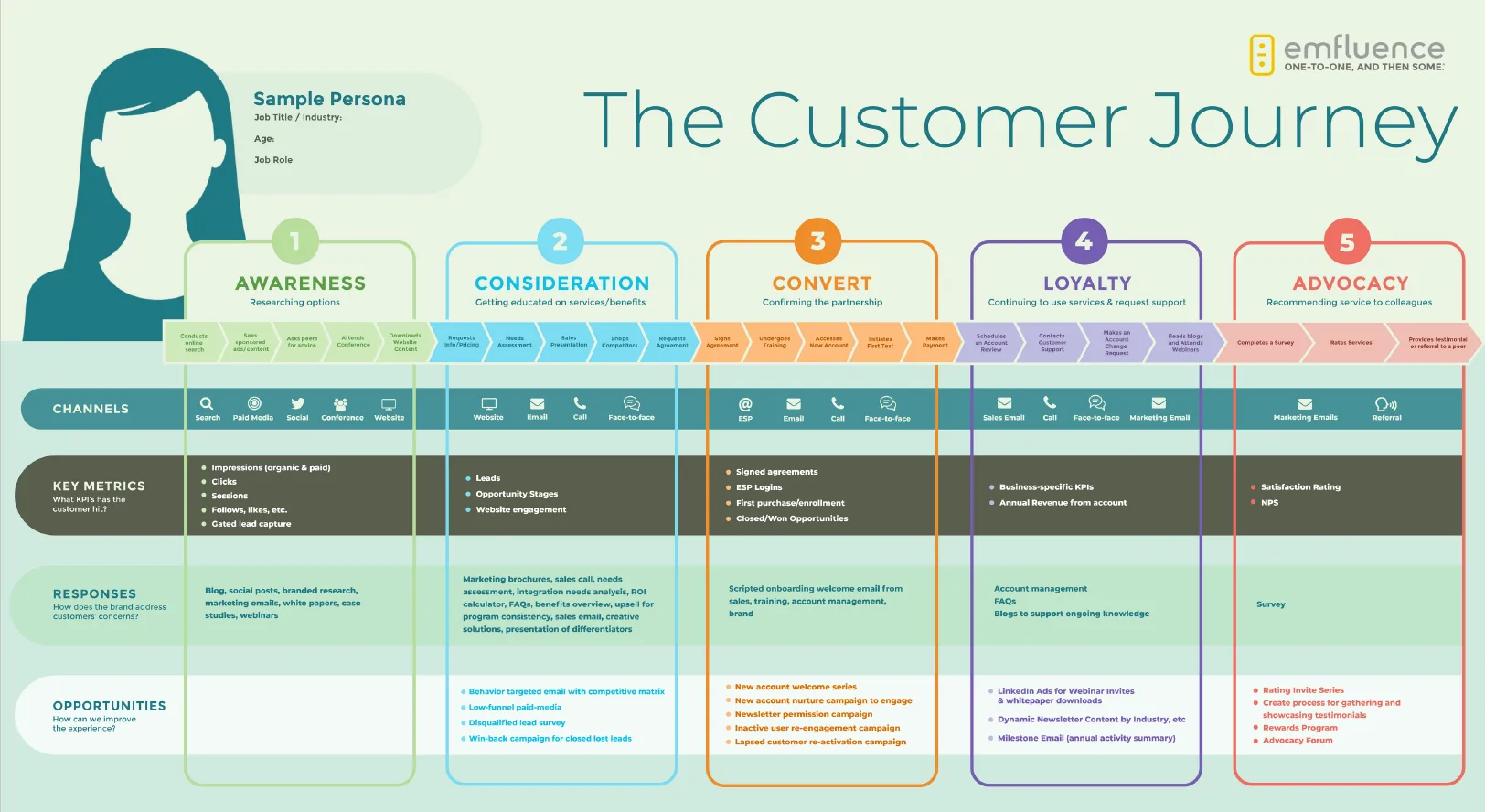
As another example, we chose the Microsoft Dynamics customer journey map because it’s simple yet detailed, offering a clear structure that can be applied to various businesses. This map outlines a typical customer journey through five stages: Awareness, Consideration, Conversion, Loyalty, and Advocacy. At each stage, the customer interacts with the brand through different touchpoints such as email, social media, events, and customer support.
What we can learn from this example: This journey map offers a clear framework for understanding customer behavior across multiple stages. The map also highlights the importance of collaboration across different departments to ensure that each stage of the customer journey is fully optimized.
Example 15: Telecommunications
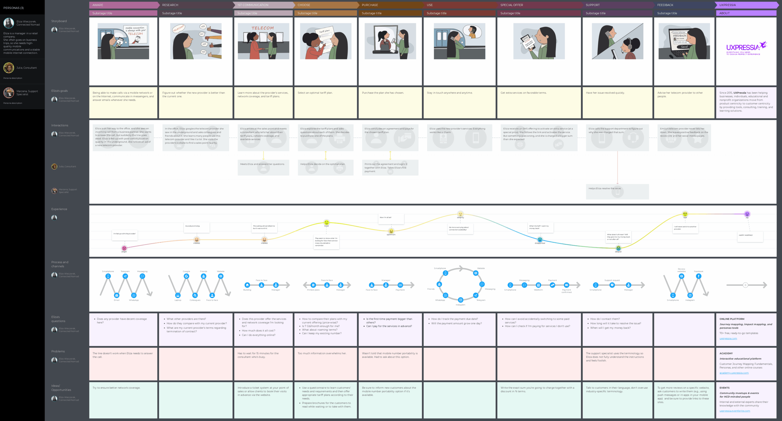
We chose this telecom customer journey map because it clearly shows a full customer experience from awareness to feedback, making it easy to follow and use as a template. The map follows Eliza, a retail manager unhappy with her current provider, as she looks for better mobile and internet service.
The journey covers all the key stages Eliza goes through – checking coverage, comparing plans, choosing a tariff, purchasing, using the service, and finally giving feedback. Along the way, it highlights her goals, questions, and pain points, plus the people she interacts with, like support specialists and consultants. What makes this map stand out is how it combines narration, channels, and interactions in one place, saving time and making the journey more understandable.
What we can learn from this example: This map shows the value of including multiple personas to reflect real customer interactions. It also demonstrates how mapping customer emotions and common problems helps identify where improvements matter most.
Parts of the User Journey Map
A typical user journey map generally includes several key components:
-
Actions: The specific steps or tasks that the user takes during their interaction with the product or service. This includes the actions the user performs to reach their goal, such as signing up, making a purchase, or navigating through a feature.
-
Touchpoints: The moments where the user interacts with the product, service, or brand. These can include website visits, customer support, emails, advertisements, or social media interactions. Touchpoints are crucial for understanding how users engage with the brand at various stages.
-
Pain Points: These are the challenges or obstacles the user encounters throughout their journey. Pain points highlight areas where users feel frustrated, confused, or dissatisfied with the experience, helping teams identify areas for improvement.
-
Opportunities: Insights that emerge from the journey map which can be used to enhance the user experience. Opportunities often arise from addressing pain points, improving user flows, or finding ways to make the journey smoother or more enjoyable.
-
Emotions: The feelings the user experiences at different stages of the journey, whether positive or negative. Emotions help teams understand how the user feels during each interaction and can indicate where improvements in the experience can make a big impact.
- Persona (optional): Some teams use personas, which are detailed, fictional representations of the target users, to help humanize the user journey. Others, however, prefer to speak more generally about their customers, avoiding specific persona creation. Personas can provide deeper insights into motivations, goals, and behaviors, but they are not always necessary for every mapping process.
How to create a user journey map?
Creating a user journey map is an iterative process that not only includes building a map itself, but also a lot of user research and usability testing done throughout the whole process.
Creating a user journey map for your specific persona helps to look at the product from their point of view, uncover pain points and opportunities for fine-tuning the user flow in order to make it more intuitive.
To create a user journey map we recommend following these 7 steps:
- Set the objectives
- Define user personas
- Get to know your audience
- Define the journey phases
- Map out each phase
- Validate the user journey
- Identify confusions and areas of improvement
Check out our user journey map page, where we explain each of the steps in detail and walk you through the process of creating your own map.