Usability testing is a go-to practice for researchers to uncover usability issues and evaluate the design of the product. It can be conducted using various usability testing methods, however the goal is usually the same: discover how end-users interact with the product and what roadblocks they encounter.
In this part of the guide we are going to analyze a couple of usability testing examples of the world famous brands we all love and follow. We’ll go through the goals of each study, the methods and tasks chosen as well as their outcomes.
Let’s jump right into the examples.
Usability testing example #1: Zara
Our first usability testing example will be from a well-known clothing brand Zara. A fan of their clothing on Medium shared that they frequently encountered problems when trying to shop using Zara’s app. They decided to conduct a couple of usability studies to find out if other users are having the same problem and redesign the interface.
Usability test
After the empathizing stage during which they focused on creating detailed user personas, it was time to conduct usability testing. The researcher chose guerilla usability testing as their primary method.
They went to the mall to locate frequent Zara shoppers and performed the usability test with a total of 7 people.
Here are some of the tasks they used:
- It’s been cold lately and you’re looking for a winter coat. What do you do?
- You see a coat you might like. Can you walk me through how you would decide whether this is a coat for you?
- You added the coat to your cart, but you realize the size is wrong. How do you fix that?
Outcomes
As a result, the researcher got a handful of information about the users’ behavior on the app. They started with reviewing the recordings and pointing out the main usability problems of the application.
With the help of affinity mapping they were able to categorize problems into several groups: search/filter, cart edits, picture carousel, dropdown menu and others. By prioritizing the issues they decided which fixes are important to focus on first and were able to create a design prototype that would help to solve them.
The prototype was later tested with 7 more users to ensure there were no usability issues left.
Read the full case study by William Ng on Medium.

Usability testing example #2: Quora
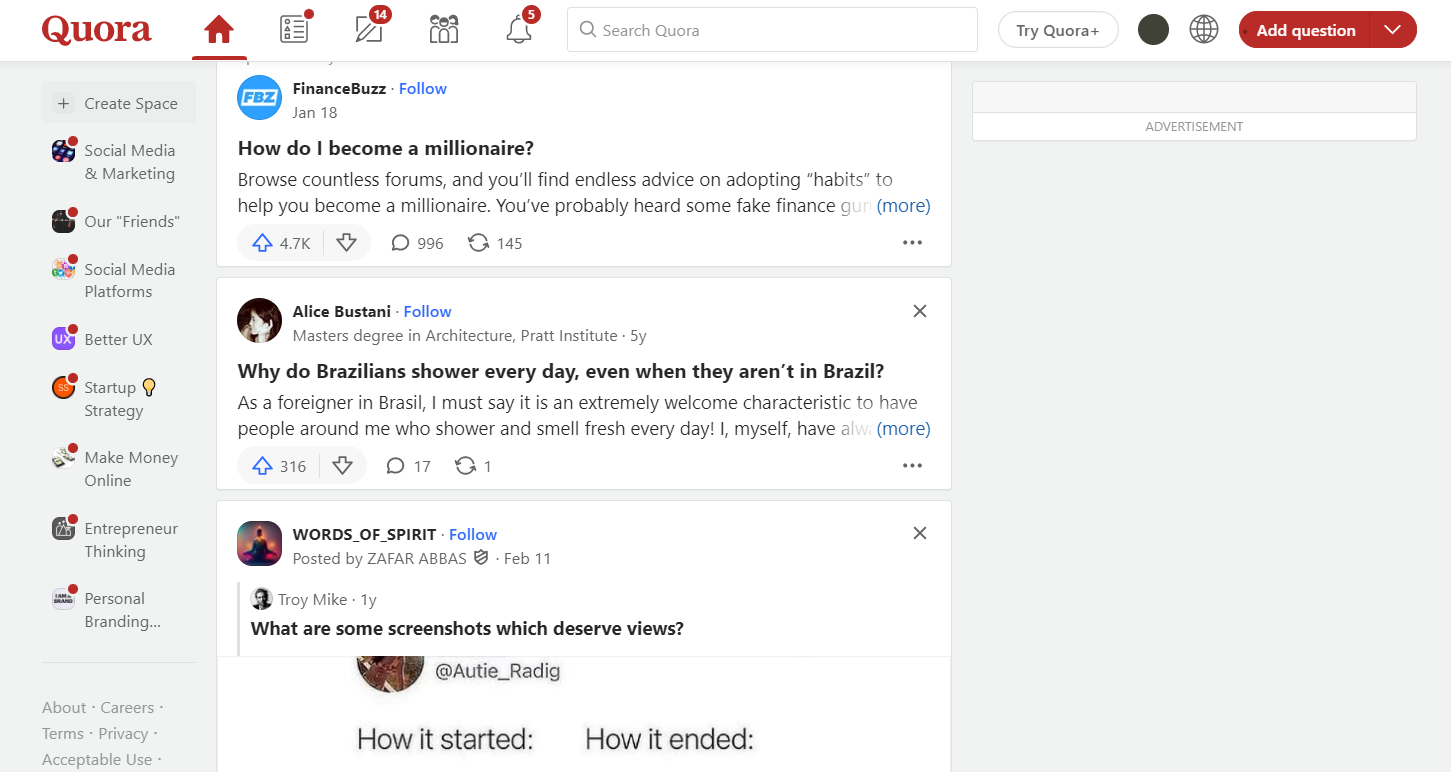
The second usability study was conducted on Quora, a Q&A social network. The goals of the study were to identify what usability problems Quora users encounter on the website, discover opportunities for improvement and overall get insights about how users interact with the product.
Usability test
The test was conducted by Rangga Ray Irawan during the times of Covid-19 so the researcher decided to go with the remote usability testing approach. 5 users from different backgrounds were chosen to participate in the testing session.
They were first asked a couple of pre-test questions that helped researchers to get to know them better. The questions were about the use of social media, quora and their opinions of it as well as some typical questions about participant’s demographics.
The test consisted of 9 tasks. All of them were designed to reflect real-life scenarios of users interacting with the platform and testing its main features.
Here are a couple of examples:
- “You’re just starting out investing in stocks. But you are confused about what stocks are suitable for beginners. Then you decide to ask questions on Quora. Show us how you can ask a question on Quora.”
- “You are an article writer. To fill your spare time, you would like to share a link that you have written on Quora. How do you share a link in Quora?”
- You’re reading a post on Quora, and then you come across an answer that is so smart and interesting that you decide to support the answer. Show us how you do it.
After the test, participants were exposed to a couple of post-study interview questions.

Outcomes
The success rate of the whole test was roughly 71%, with 45 attempts to perform the tasks and 10 failures.
Some of the usability problems they uncovered were:
- Icons and buttons that are too small and hard to identify
- Confusing terms such as “downvote”
- The “find room” button did not correspond to users’ expectations etc.
The researchers also came up with solutions to these problems which you can check out in the Quora Usability Testing Case Study.
Usability testing example #3: McDonalds
In 2016 McDonalds in the UK were launching the mobile ordering app and needed to test it with users to pinpoint problems and evaluate the user-friendliness of their interface. At the time, the study was conducted by SimpleUsability, a behavioral research company.
Usability test
They conducted a total of 15 usability sessions and topped it off with a survey that 150 participants filled out after interacting with the McDonald’s app.
Outcomes
With the help of collected information SimpleUsability were able to uncover several severe usability issues:
- Poorly-designed CTAs
- Communication problems between the app and the restaurant
- Lack of personalization in the app and customization of specific orders
The company then provided recommendations for optimizing the UI of the application.
Read the full McDonalds Usability Testing Case Study.
Usability testing example #4: e-commerce website
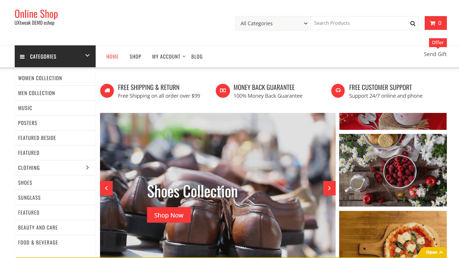
Our last example is taken from one of our Demo studies, particularly for the website testing feature. It’s a great showcase of how UXtweak can help you test digital products quickly, effectively and on a budget.
The test was conducted on an e-commerce website with a goal to test usability and intuitiveness of the user interface.

Demo E-commerce website.
Usability test
The website was tested with a total of 28 respondents.
Here are a couple examples of the tasks that participants were asked to complete:
“You’re looking to buy a pair of footwear that you could use for running and other fitness activities. Find more details about the product you’re looking for on our website.”
“You ordered something in this online store yesterday. Find out whether your item has already been sent. Number of your order: 56915”
“It’s been long since you shopped here and you’ve forgotten your password. Where would you be able to reset your password?”
The participants were also asked a couple of pre-study questions to determine how often they shop online and the post-study questions that were primarily focused on the difficulty of the tasks.
Outcome
You can check out the sample results of this usability study. As this is just a demo of the feature, we did not have a goal to improve anything, however, by looking at analytics of each task you can clearly pinpoint the problems.
For example, looking at the first task where participants were asked to buy running shoes, we can see that the success rate is only 55,6%. Meaning, almost half of the participants failed to complete the task. This may be a sign of severe usability issues or even a navigation problem.
By re-watching the test recordings and seeing where exactly participants encountered problems you’re able to locate and eliminate the issue.
Check out this and other UXtweak Product Demos:


