

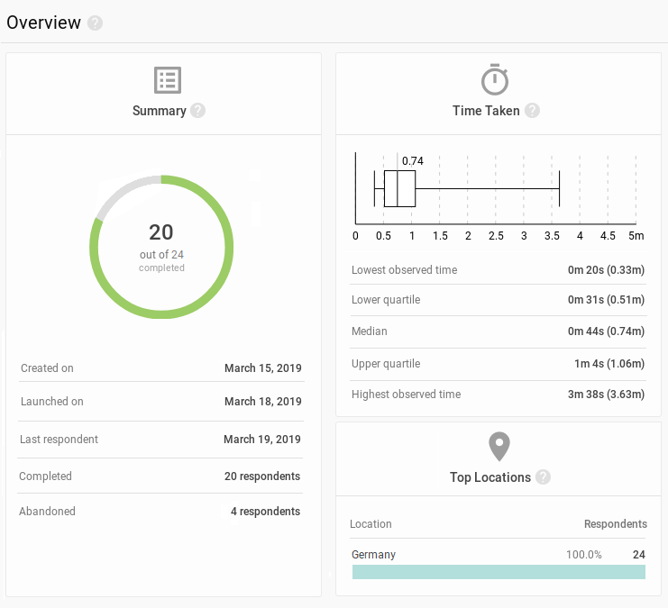
Summary, time and location
The Overview contains the big picture of the Preference Test study. Use the summary to keep track on the current state of the study, Time Taken to see how long it takes respondents to complete, Locations for where they came from.