Have you ever found yourself leaving a website just because it’s complicated and hard to navigate? Let’s be honest, we’ve all been there. This is usually the case when people try to create websites without having the user in their mind. In this guide, we are going to show how you can use the card sorting method to empathize with your users and organize content according to their expectations.
What is card sorting?
Card sorting is a UX research technique centered around your users. They group individual labels (sort cards) into categories according to what makes sense to them. These sorted labels can represent anything you need to organize, such as content, features or documents. We refer to these labels as cards, giving the exercise its name. You might want to do multiple card sorting sessions too.
Card sorting is truly easy to comprehend, which is why it’s commonly used to find out how people perceive information and in what way they expect it to be organized. Card sorting results help you get valuable insights into potential information architecture (IA) models, structure your website or app in an intuitive and user-friendly way, and make sure users won’t get lost when trying to complete their goals with your service or product. Even with card sorting being accessible and easy to use, it is important to conduct multi-method approach in your research.
As for the categories, depending on the type of study, they may be left up to participants to define by themselves, or they may be defined in advance.
Card sorting and UX

In terms of UX as a whole, card sorting is the perfect technique for generating insights on how to organize your website in a way that makes sense to your users.
Bad navigation is one of the main reasons why people leave websites. And a bad information architecture that underlies it is the leading cause.
If users simply find it impossible to find their way around the content, nothing else you do can undo the damage until the information architecture has been fixed. With card sorting, you can avoid such trouble, since you’ll know how your users think. This way, you can build an intuitive menu structure that will guide users towards wherever in the app/site has become they need to be.
As a UX research technique, card sorting will help you to:
- Find out how users perceive the contents of your website/app relate to one another
- Define content into categories and structure of menus or entire app/site
- Create category labels
- Build a logical and friendly user experience
Benefits and disadvantages of card sorting
Like everything else in this world, card sorting has both its advantages and disadvantages. Let’s take a look at some of the main points you need to be aware of.
Benefits of card sorting
It’s cheap – can even be conducted for free with UXtweak’s online Card Sorting tool. For offline card sorting you just need a pen and paper just create a physical cards and you are good to go.
It’s fast – It only takes a couple of minutes to set up and complete a study. Online card sorting tools deliver results almost immediately.
It’s a simple technique – is basically just dragging and dropping cards into predefined categories. It’s a very intuitive process that is simple to explain and understand to your target users.
It’s a proven method – throughout the years, card sorting has become a proven user research technique used by researchers from all over the world. It’s known to give valuable results and great insights into user expectations.
Disadvantages
The analysis can be time-consuming – while the technique itself is quite fast it can take some time to analyze the results of your card sort, especially when it’s offline. However, if you’re using an online card sorting tool, they’ll do a big part of this job for you.
Card sorting is not always enough by itself – Trying to structure the content on your website or app in a way that is ‘just right’ for all your users, is not an easy task. In many cases, the data from card sorting is much more valuable when evaluated with tree testing.
When do you need card sorting?
Card sorting can be useful at the various stages of the design and development process. Here are a couple of them:
- When you are creating a new digital product or service and need to decide on its structure
- When you are unsure how to label your categories or want to make sure the labels represent what you would expect to users
- When you want to test an already running website and find out if the information on it is logically grouped
- Before a redesign, make sure the new content will be grouped according to user expectations
- Whenever you want people to sort items into groups for you, it doesn’t necessarily need to be connected to UX
Why do you need card sorting?
The simple answer is, to find out how users perceive and navigate information. We often tend to forget that people all have different mental models. We all have our biases, depending on who we are and what we know. A buyer always behaves and thinks differently from the seller.
While you may think that your menu structure is as intuitive as can be, the user, on the other hand, may be struggling to find pieces of information just because they expect them to be somewhere completely different.
Card sorting helps you avoid this type of confusion and saves you from high bounce rates by helping you take full advantage of your audience’s existing mental model instead of forcing them to adapt to yours. It is your ultimate way to look at the site’s or app’s structure from the users’ perspective and alter it to fit their needs.
How to conduct card sorting?
Check out this quick video that explains how to set up a Card Sorting study with UXtweak:
There are several steps to take in order to conduct a successful card sorting study:
- Decide on the approach
- Choose the type of card sorting
- Define your cards
- Recruit the respondents
- Conduct the study and analyze the results
Let’s break them down in a quick overview. In the next chapters of this guide, we will cover the various aspects of card sorting in more detail.
Decide on the approach
First things first, you need to decide if you’re going to conduct your card sorting study as online card sort or in-person card sort. The in-person approach is going to be much more time-consuming and probably a fair bit harder to analyze. However, you’ll get to see your real users’ interaction with the cards and hear them verbalize their thoughts. Card sorting moderated in-person also gives you the ability to ask follow-up questions and find the reasons behind the participant’s actions.
Online card sorting, on the other end, is a lot more flexible. You can conduct your study anywhere at any time. The number of participants is unlimited and it’s a lot cheaper and faster than the in-person method. There are plenty of online card sorting tools to assist you with the study. They’ll analyze all the collected card sorting data for you and present them in a form of comprehensive graphs and shareable reports.
Read more about online vs. offline card sorting.
Choose the type of card sorting
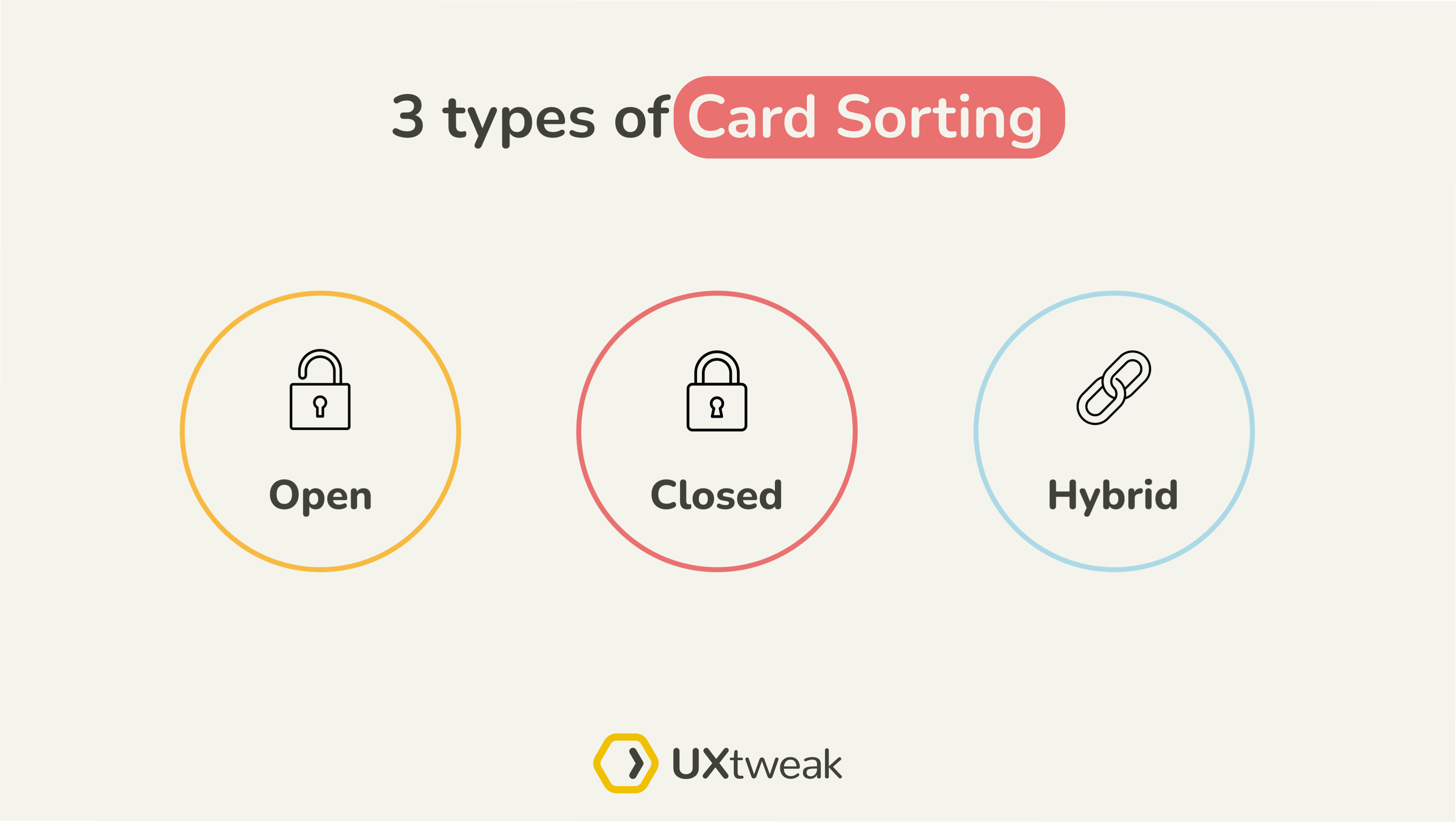
There are 3 main types of card sorting for you to choose from, depending on the origin of the categories used. These are open card sorts, closed card sorts and hybrid card sorting.

- Open Card Sorting: Here, participants are provided with cards listing various content items or features, which they sort into groups and label themselves. This approach is essential for uncovering users’ mental models, offering insights without the constraints of predefined categories.
- Closed Card Sorting: This variant offers participants a set of established categories into which they must organize the content items. It’s particularly useful for evaluating current categorizations or testing specific hypotheses regarding content organization.
- Hybrid Card Sorting: This method merges the flexibility of open card sorting with the structure of closed card sorting. Participants sort content items into predefined categories, but they also have the option to create new categories when the existing ones don’t fit. This approach offers a balanced perspective, allowing researchers to gather user insights on the predefined structure while also understanding users’ own categorization logic. It’s particularly effective for refining and validating an information architecture, providing a nuanced understanding of user mental models and category expectations.
Different types of card sorts are suitable for different situations. Learn more about card sorting types and choose the one that fits you most.
Check out our Open and Closed Card Sorting demos to get a better understanding of their differences:
Define your cards
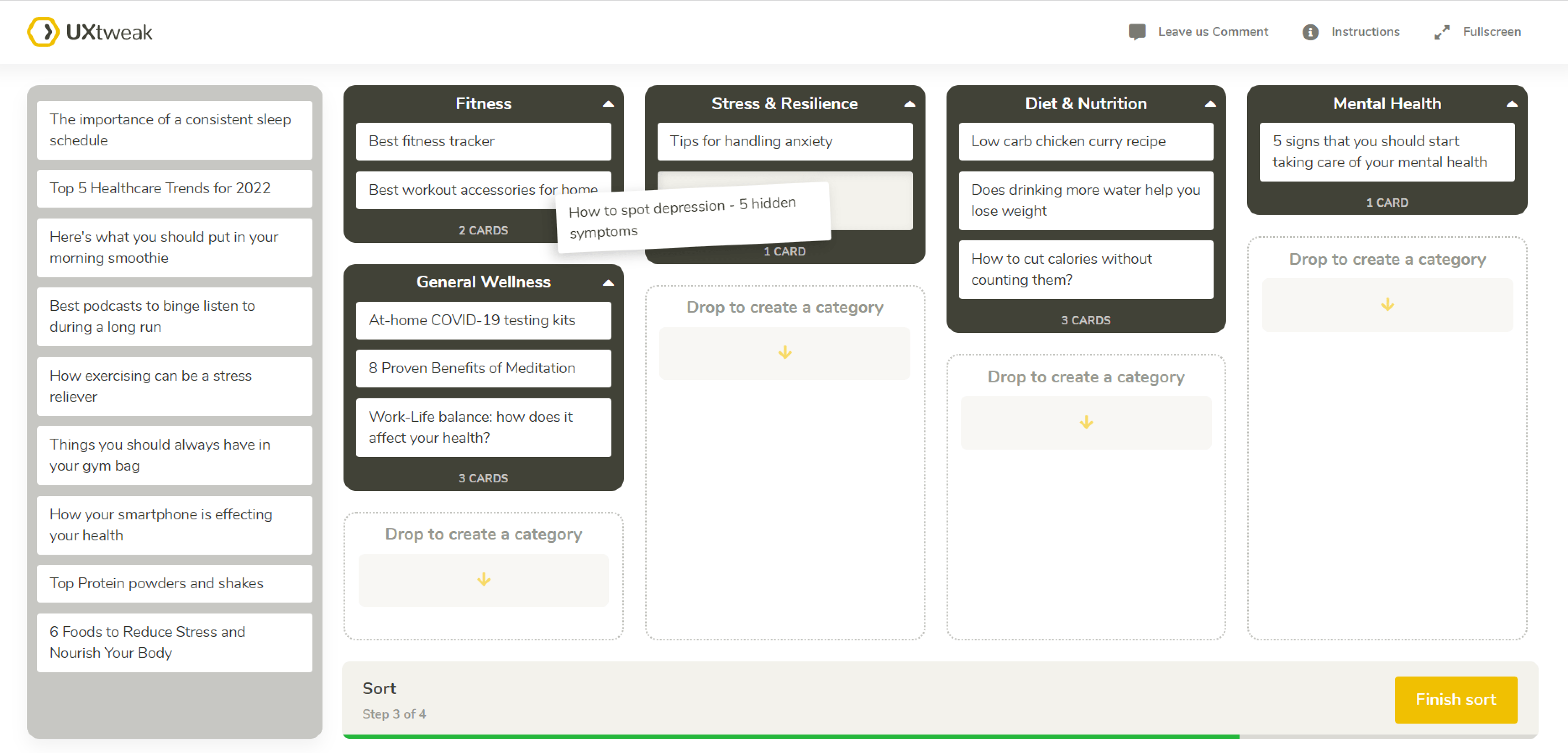
As was stated above, each card in your study should represent the content item you want the users to sort. For example, let’s say you are launching a blog page on your website and want to organize the articles into categories. You can have multiple ways how to approach it.for example you use category names and create actual cards out of them, present those to your participants and let them sort cards into categories.
Here’s a great card sorting example for an online healthcare magazine:

Recruit the respondents
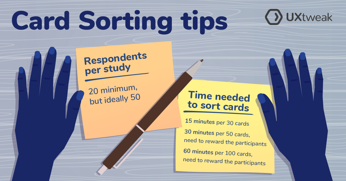
Recruitment for card sorting isn’t much different from recruitment for other research activities. The optimal number of respondents for a card sorting study is around 15-30 participants. This is a good number that’s reasonable to analyze, yet allows patterns to come to the surface.
There are various ways for you to recruit your participants depending on what tools you’re using. With tools such as UXtweak, where you can share your study simply with a link, there’s no limit to your imagination of how to reach your audience. Do you have a social media presence? Use that. If you already have a user base, you can send them a link via newsletter. Don’t forget to motivate them by offering a discount coupon, for example.
Check out this video where we share 4 ways to recruit usability testing participants for free:
Alternatively, some card sorting tools offer participant panels where you can buy targeted participants for a reasonable price. One such service is UXtweak’s User Panel.
UXtweak’s User Panel makes recruiting easy by giving you access to more than 155 million panelists with 2000+ profile attributes for advanced targeting. Another cool recruitment tool found specifically in UXtweak is the Recruiting Widget, which you can put on your website to catch your site’s real visitors. It’s a quick and inexpensive way to recruit your real customers and potential users.


Analyze the results
After the study, you’ll find that you’ve obtained lots and lots of data. If you’ve ever done card sorting by hand and then used an online tools, you’ll find going back to offline difficult. A good tool does the heavy lifting of processing and breaking down the data for you, so that you may focus more on what the data actually means.
A card sorting tool such as UXtweak’s Card Sorting processes results automatically so that you may analyze it from different perspectives, with a number of statistical and visual aids.
Read here to learn how to analyze the results of a card sorting study.


