In the world of digital products, first impressions are key. A user only needs around 5-7 seconds to form an opinion about your product and decide whether or not they are going to stay on your page. Therefore, it’s quite easy to lose some clients just because your design didn’t convey the intended message. Luckily, there’s a way to test whether your product’s first impressions align with what you want it to be and catch users’ attention. And that’s by conducting five second testing.
Key Takeaways:
💥 A five second test is a user testing method that aims to gauge the first impressions users have from your design.
✅ It helps to test messaging, emotional responses to your designs, recollection, and user engagement.
💡 The results of five second testing pinpoint what elements of your design need to be more prominent, help to spot visual hierarchy problems, and assess if the design conveys the right message.
💸 It’s a quick and cost-effective usability testing method.
🐝 You can conduct five second testing using an online five second testing tool
Table of Contents:
- What is a five second test?
- What are the benefits of five second testing?
- What are the limitations of a 5 Second Test?
- When to do five second testing?
- How to conduct a five second test?
- What questions to ask during a five second test?
- What are the best practices for 5 second testing?
- Best 5 Second Test Tools
- Five second test example
- Five second test vs first click test
What is a five second test?

A five second test is a research method that aims to gauge the first impressions users have from your design. The test participants are shown a design for just a couple of seconds and are then asked to answer specific follow-up questions about it.
Five second testing questions are all focused on understanding what parts of the design participants recall most vividly and what are their first impressions about the product. They’re widely used to see if web pages are expressing their intended message successfully.
Qualitative insights from five second testing can help with UX and messaging optimization, as they pinpoint directly what parts of the design stand out the most and what your users remember after seeing your product for the first time. Depending on the feedback received, designers might decide to tweak certain elements to make them more prominent or to better communicate the intended message.
Why 5 seconds?
Research and experience show that people tend to evaluate web pages really quickly and usually spend only between 10-20 seconds there before leaving. During this time, they need to receive the message that you want to convey.
There are also indications that when respondents have an opportunity to look at a design for longer than five seconds during a test, they take more of an analytical approach and notice details they’d normally miss.
However, 5 seconds should not be treated as a general rule. Depending on the type and complexity of your design, as well as the goals of your research, you might need to make this timeframe a couple of seconds longer or shorter. The key message here is that 5 second testing evaluates first impressions in the initial couple of seconds of seeing the design.
What are the benefits of five second testing?
- True first impressions: Five second testing is a unique usability testing method that helps to mimic the rapid judgments users often make in real-world browsing situations. This allows you to collect honest unbiased insights from users which is invaluable for improving their future experiences.
- Efficiency and cost-effectiveness: This research study is extremely quick to conduct and analyze. This type of rapid feedback can be especially valuable in agile development environments or when working with tight timelines. The short duration of the study also allows for testing with a larger group of participants.
- Versatility: Five second test is a universal approach for evaluating first impressions. This method is highly versatile and can be used for not only evaluating digital products like websites or apps but also logotypes, advertisements and so much more.
- Better engagement and visual hierarchy: By understanding what users perceive and recall from a brief glance, designers can enhance the clarity and effectiveness of their designs and find out exactly what needs to be optimized to meet their goals.
What are the limitations of a 5 Second User Test?
A five second test’s simplicity is also its limitation. It is good to gauge the effectiveness of users’ first impressions. However, if you want to test other aspects of user experience, have users interact with more complex designs and prototypes and have them complete longer tasks you should choose another usability testing tool.
When to do five second testing?

Five second testing is a UX research method that can be useful at different stages of the design and development process. Some of the most common use cases are:
Gathering initial impressions on design prototypes
Five second usability tests can help you evaluate the designs at their early stages and tweak them throughout the process of fine-tuning your prototypes. It’s also a great method for comparing and choosing between 2 variations of the same design. Use the five second test method to see which design stands out to users more and better communicates your message.
Evaluating an existing product
If users are not engaging with your content as expected, metrics show low conversions and high bounce rates, this may be the sign that you need to conduct a five second UX test to spot the problem areas of your visual hierarchy, messaging, and UI design overall. Test your designs with real users and discover what keeps them from engaging and converting.
The same goes for when you’re planning a big redesign. Five-second tests can help you compare a new version to the old one and find areas where significant tweaks are needed.
Marketing and advertising
Five second tests are perfect for quickly evaluating your marketing messages and the effectiveness of landing pages for specific campaigns. They show if the users understand the message as intended and how they perceive the brand after.
How to conduct a five second test?
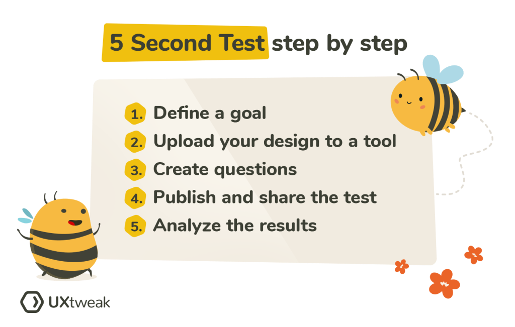
1. Define your goals and prepare the materials
First things first, define what you’re going to be testing and prepare the designs. Are you looking to evaluate the visual appeal of your design, the messaging, brand recall, or something else? Clearly defining that will help to write suitable questions and ensure an insightful study.
2. Upload the designs to a tool and set up the test
Decide on the format of your future study. Are you going to be conducting it online or in person? For online testing, we recommend choosing an online five second test tool to guarantee your study is quick, efficient, and cost-effective.
Tools like UXtweak guide you through the setup process and help to launch a five second test in just a couple of minutes. You just need to upload your designs and add the follow-up questions – that’s it!
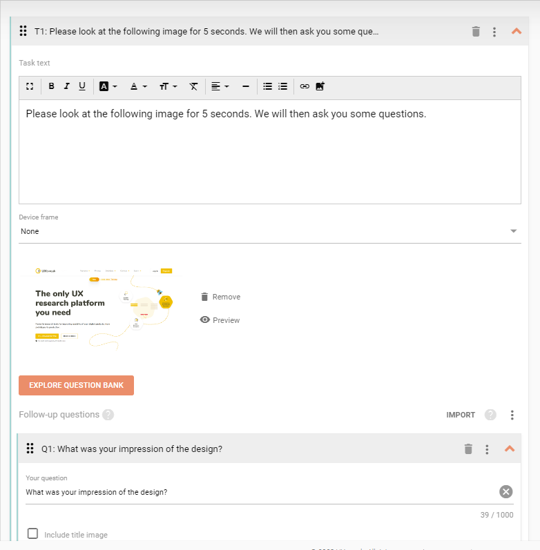
The five second test set up process inside UXtweak five second test tool.
If you’re working on a specific case where first impressions may take longer, you can set the timer to show the designs for up to 30 seconds.
3. Create questions
Decide what questions to ask based on your goals.
⬇️ Explore 5 second test questions below ⬇️
4. Recruit the participants & conduct the test
We recommend recruiting your target users to ensure the feedback you obtain is relevant and helpful.
If you’re testing an existing product, you can recruit participants with the help of our Onsite Recruiting Widget. A widget will pop up on your website asking users to participate in a quick study for a small reward. This can be a discount code or a gift card, for example. You can also recruit your own database of customers using our participant management solution Own Database.
Alternatively, you can recruit people representative of your target audience from our 155M+ User Panel. Depending on the type and duration of your study it can be as cheap as 9€/respondent.
There are also a couple of free recruiting methods out there for those who are on a budget. These include leveraging social media communities, email databases, etc. Learn more about those in this quick video:
5. Analyze the results
Gather and organize all the responses from participants in a structured format, like a spreadsheet or a database. If you were conducting five second testing with the help of an online tool like UXtweak, this data will be automatically organized in your results dashboard.
To make the analysis process easier depending on your questions, categorize feedback into relevant buckets, e.g., Positive/Negative Impressions, Remembered/Not Remembered Elements, etc. Look for frequently occurring words or phrases in users’ answers to understand common perceptions and recollections.
Analyze and identify any recurring problems or points of confusion among participants, such as misunderstood messages or overlooked elements.
Determine the percentage of participants who remembered key elements, got the intended messages right, or had particular perceptions. Then, analyze participants’ open-ended feedback and comments to uncover more insights and understand possible reasons behind quantitative trends.
Finally, evaluate the findings in the context of your initial objectives. Is your design achieving its intended purpose in the context of first impressions? Do users successfully get the message you’re trying to convey?
Based on your analysis identify areas of improvement in the design, fine-tune it and test again until you see that it works the way you expected.
What questions to ask during a five second test?

The five second testing questions you write should aim to gather insights related to the specific objectives you have for conducting the test. There are different types of those, depending on what you’re looking to find out in your research.
Questions to test recognition
- What elements, words, or images do you remember seeing?
- Can you recall any specific text or headline?
- What are elements you can recall?
Questions to test comprehension
- What do you think is the main purpose of this page?
- Can you describe what this company does based on the design?
- What do you believe is the primary message being communicated?
Questions to assess emotional responses
- How did the design make you feel?
- What is your impression of the design?
- Did you find the design visually appealing? Why or why not?
- What adjectives would you use to describe the design or brand based on what you saw?
Questions to test branding
- Was there a brand or company name visible? If yes, can you recall it?
- Did you recognize any logos or brand symbols?
- What would you say is the brand’s core message based on the design?
- What product do you think this company is offering?
Questions to test engagement
- Was there a specific action that the design wanted you to take (e.g., click, sign-up, purchase)?
- Did anything in particular catch your attention or make you want to engage further?
- Were any offers, deals, or incentives presented? Can you recall them?
What are the best practices for 5 second testing?
- Don’t explain the test: Make sure participants don’t know in advance what you’re going to be asking and try not to provide any additional guidance during the test. Let the participants just follow the instructions of your five second testing tool. This way you’ll be able to gather unbiased first impressions and honest feedback.
- Only test relevant material: Try to not overwhelm the testers with too much information and only test the relevant parts of your design. For example, if you’re looking to test the first impression of your website’s homepage design, there’s no need to add the full landing page screenshot, just the top part, which a user sees first.
- Align questions with your objectives: The way you write your questions will determine the outcome of the whole study. To ensure that you gather helpful insights, align the questions with the goals of your research. Make them clear and straight to the point and avoid asking irrelevant information.
- Test with static images: Avoid showing moving objects and any other type of motion that can distract the participant from the design itself. We recommend going for static images, screenshots, and design prototypes.
- Repeat testing after making the changes: Make sure to repeat the test again to validate the changes made after the first round of research.
Best 5 Second Test Tools
1. UXtweak
UXtweak offers powerful usability testing tools for websites and web apps, from prototype to production, as well as information architecture research and user behavior analytics. UXtweak offers a great five second test tool that is quick and easy to set up. We provide you with advanced analytics and pleasant UI on the best price-quality ratio.
The great thing is, you can create a free account and conduct your 5 second user tests absolutely with no charge!
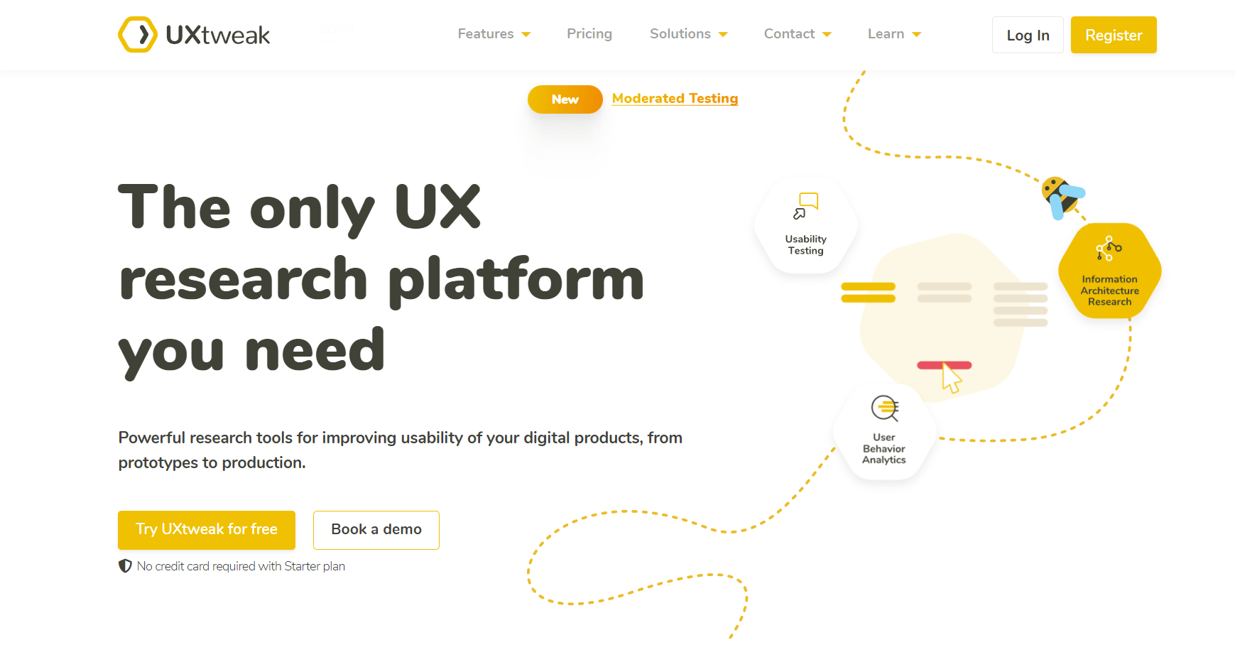
Reasons why to use 5 Second Test with UXtweak:
- Rapid and effective tests
- It’s simple to use and has a nice UI
- Nothing has to be installed; simply send the testers a link to the study, use a Recruiting Widget to recruit testers from your own site, or order testers via UXtweak’s User Panel
- You can customize the research to your liking
- Advanced analytics that are easy to understand
Downsides:
- Supports only 14 languages
Pricing:
UXtweak offers a free starting plan that includes an unlimited number of live studies and no time restrictions, making it ideal for smaller projects.
You may also select between a Plus plan for $49/per month or a Bussiness Plan for $144/month (all billed annually). A customized plan that is tailored to your unique needs is also possible.
Try UXtweak’s 5 Second Test tool for yourself now!
2. UsabilityHub (now Lyssna)
UsabilityHub is another remote user research platform. They offer a couple of testing tools to help you validate any design decision on videos, logos, packaging, or animations. A five second test is also included in their toolkit.
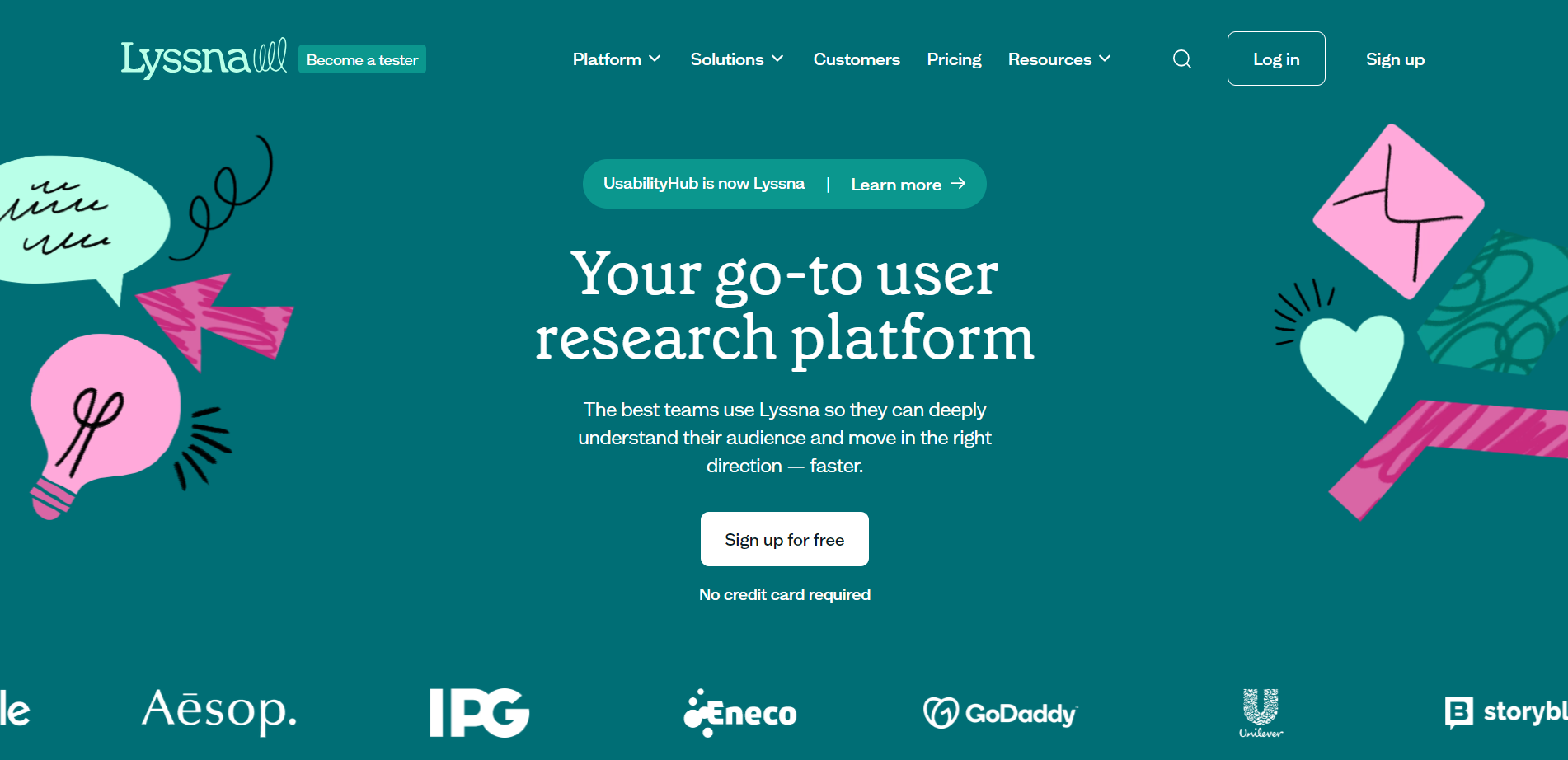
Why UsabilityHub?
- Speedy customer experience feedback
- Built-in participant panel
- Nice UI
Downsides:
- You get textual responses to your study questions
- There isn’t enough help for less experienced users to get the most out of their testing
- Unclear instructions
- Weak testers panel causes frustration among users because of the poor quality of responses
Pricing:
The free version is just for testing purposes and lasts no more than 2 minutes.
Their Basic plan is 75$ per month and allows you to test for up to 5 minutes. The Pro plan costs 175$ per month and includes multi-user plans, unlimited testing, and bespoke branding. A custom Enterprise plan is available.
3. Useberry
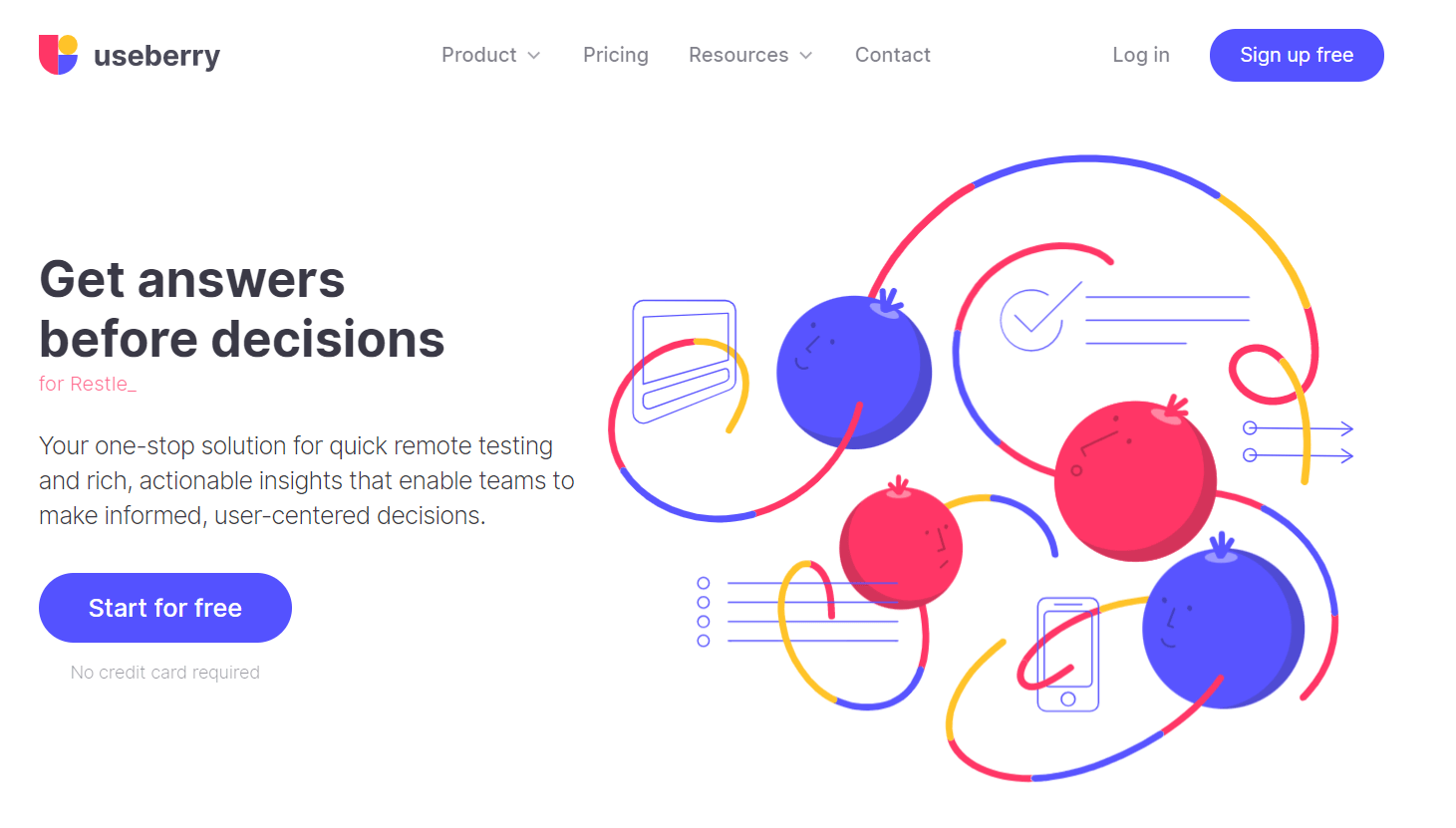
A user testing service that collaborates with popular prototyping platforms such as Xd, Figma, or Sketch. Just like all the tools above it doesn’t require any coding, making it a good fit for Marketers, Product Managers, Business Owners, or Developers. Useberry provides 5 Second Testing for testing microcopies, CTAs, variation performance, and design variations.
Why Useberry?
- You can get access to audiences from 34 countries
- Testing of Micro Copies, CTAs, variation performance, and design variants
Downsides:
- Does not run on mobile devices
- It is not for Large Enterprises
- Free plan doesn’t allow you to do much
Pricing:
A free plan allows you to gather up to ten answers per month. The Growth plan is $67 per month and allows up to 300 responses per month. A customer Enterprise plan is available.
4. Maze
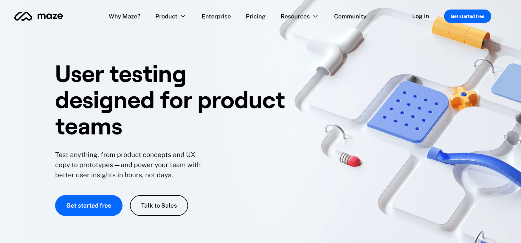
Maze gives product and marketing teams the ability to test anything from prototypes to copy, as well as gather user feedback, all in one spot. With their tool, you can quickly collect user feedback across teams and collaborate to improve user experiences. They also offer a five second testing tool.
Why Maze?
- Easy and quick setup
- Fast insights
- Pleasant UI
Downsides:
- They don’t offer a lot of demographic possibilities from which to choose a user base
- For a newbie, it might be hard to understand the results
- It may take longer to load
Pricing:
Maze offers a free plan, which allows only 1 project and 100 respondents per month.
You can also choose their professional plan which starts at $99/ month but with only 1 active study a month. Their next plan, the Team plan, starts at 5 seats and is $1250/month (all billed yearly).
Five second test example
Conducting a five second test is a piece of cake, especially with a good tool at hand. Don’t believe us? Let’s take a look at a real five second test example from one of our demo studies!
Imagine you have an e-commerce website. The analytics on one of your pages show that users leave it way too quickly. There’s very little time to communicate key information that’ll make users want to stay. You decide to test the design to try and understand what needs to be fixed in order for users to engage with the page better.
In this specific case, you are testing the home page of your site and ask questions, such as “What is the purpose of the page” or “What is the name of the company”.
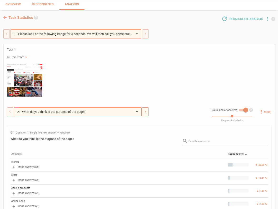
Based on the answers, you’ll be able to see how many of the participants got the page’s message in full, or at least partially, and how many didn’t get it at all. After comparing the portions of participants in each group, you’ll be able to determine what works well and what doesn’t, as well as decide on which aspects of the website design need rethinking.
Let’s see how the test looks like from the participant’s point of view.
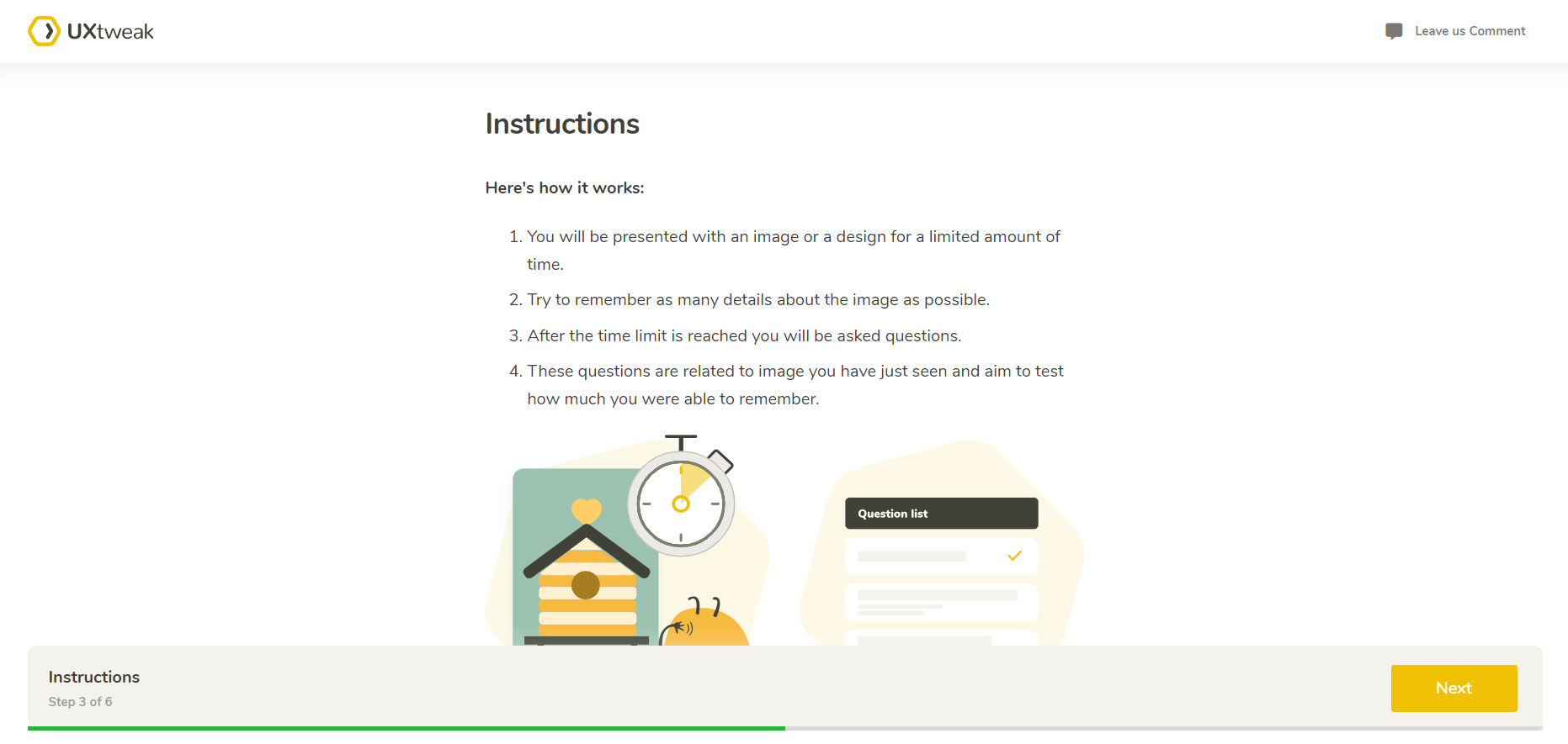
After clicking the test link we are first presented with the instructions on how the test is going to work. Here, you can also add some general questions for the respondents or screening questions to filter out the participants who do not fit your target user group.
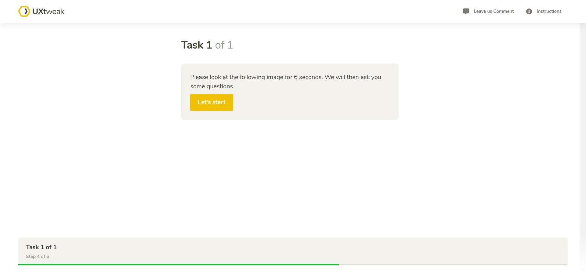
Then comes the task after which respondents see the design for only 5 seconds. In our case, the respondents first screen of the e-commerce website’s homepage.
 After the design disappears, the questionnaire pops up:
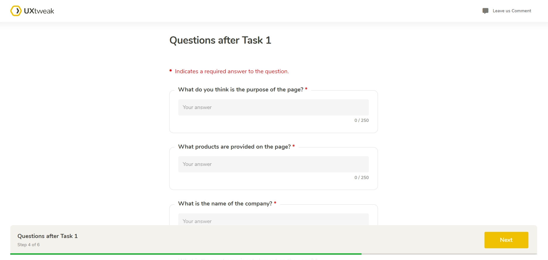
And that’s it! After respondents complete the study you get enough responses to analyze their feedback and come to meaningful conclusions. The results are all collected in a handy dashboard where you can group similar answers together, see task statistics and download shareable PDF reports with all the data.
Here’s how it looks like:
Try five second testing yourself and check out examples of PDF reports and results dashboard in this demo 👇
Five second test vs first click test: What is the difference?
Five second usability test and first click test are both usability testing methods, however, they cater to various goals and use different approaches.
As we remember, a five second test aims to gauge the first impressions users have from your design within a few seconds and is used to test recognition, messaging effectiveness, users’ emotional responses to the design, etc.
First click test, on the other hand, focuses on evaluating the initial actions users take when trying to complete a specific task with the product. It is used for understanding how users navigate the product and identifying potential usability issues related to findability and information architecture.
Depending on your specific objectives—whether you are looking to test user perception, recall, navigation, or task completion—you may choose to employ one or both of these testing methods.
The great news is, you can conduct both of these usability studies with UXtweak. Use our five second test tool to learn more about users’ first impressions of your design and what catches their attention. Turn to first click testing tool whenever you need to find out how users perceive your navigation and where they click first when looking for specific information.
Wrapping up
And that’s a wrap on our five second test guide. You now have all the tools and information you need to conduct your own five second testing and gather insights about users’ first impressions from your designs.
Why not start right now? Register for your UXtweak account and use our comprehensive five second tool to help!


