Users often tend to leave websites that are too confusing and hard to navigate. Wouldn’t it be nice to have a navigation structure that drives users towards success and assures they are not lost somewhere on the way?
Well, luckily, there’s a way to achieve this and conducting a simple card sorting study is the first step to do so. Read along to learn how!
What is card sorting?
Card sorting is a method used to evaluate the Information Architecture (IA) of a digital product, such as a website or app. It helps you organize the content according to the user’s expectations, gives useful insights on labeling and intuitive navigation.
In a card sorting study, respondents are asked to sort a number of cards into categories that make sense to them. They may also have to create and label these categories, depending on the type of card sorting you choose.
What is UX?
“”User experience” encompasses all aspects of the end-user’s interaction with the company, its services, and its products.” – Nielsen Norman Group
Basically, the term “user experience” refers to what a person observes and feels when using your service or product. It defines how people perceive your product and how easy it is for them to interact with it. Visual hierarchy, information architecture, navigation, and learnability are all parts of user experience.
How can card sorting improve your UX?
Card sorting is a method that helps you improve the UX of your app or site through optimizing its information architecture. It assures that all your content categories are grouped intuitively and that the user is able to easily find what they came looking for.
In terms of UX, card sorting can help you to:
Find out how users perceive your content
Card sorting gives you deep insights into the way users think about concepts which make up your app or site. A basic card sort will not only give you ideas for content organization but also allow you to better study your end-users, their preferences and expectations.
Create an intuitive menu structure
The ultimate goal of card sorting is to give you ideas for user-friendly IA models. The results of the study show what items users expect you to group together, under which category and so on. Using all this information, you’ll be able to create an easy-to-navigate menu structure that guides users towards success.
Define categories that make sense to the user
With the deep analytics of card sorting tools you can get insights on what categories/subcategories you need in your structure and how many of them there should be. Everything is visualized in a form of comprehensive graphs and tables, which makes it easy for you to understand which items should go together.
Come up with descriptive labels
Open card sorting gives users the ability to create their own categories and name them as they’d like. This can help you generate new ideas for labeling and avoid using complicated language that your users may not understand.
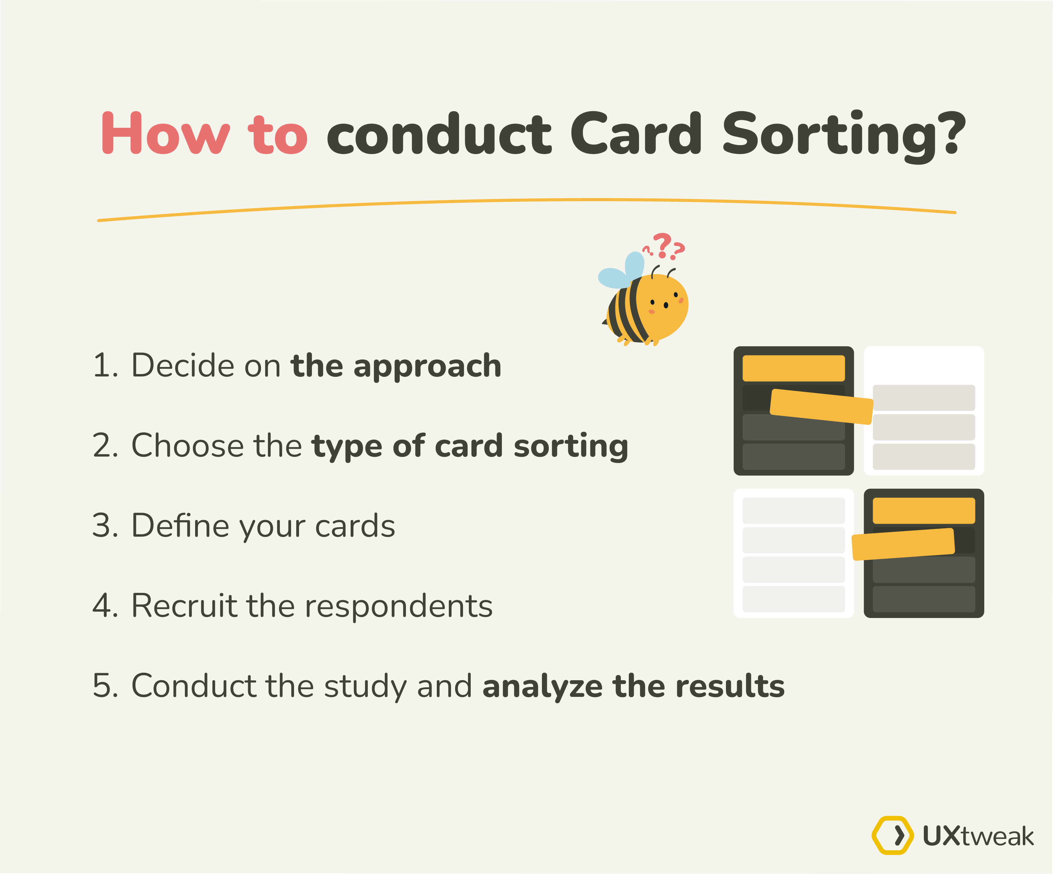
How to conduct card sorting?
With a good card sorting tool you can conduct an online card sorting in 5 easy steps:

Learn more about how to conduct card sorting in our guide or watch a quick video tutorial on how to create a Card Sorting study with UXtweak ⬇️
Card sorting example
See for yourself how easy it is to conduct a card sorting study and all the numerous insights you can learn from it. Visit our card sorting example page!


